UPDATED TO INCLUDED 2024/25 SEASON
This is the first in what I hope is a new feature on the Kit Geek Site, where we take a deeper look into the Kit History of one club, the manufacturers, the kits, the highs and lows over the years. Most of these reviews with start from 1970’s where Kit Manufacturer details become more prevalent in kit design and for the moment will only look at the club’s Home Kits (maybe change kits will come in the future).
The first club I want to take a look at is Crystal Palace, the reason for this is that over the years The Eagles have adorned kits from almost every major (and some minor) kit makers out there so the perfect club to kick start this series!
Kit History Overview
- Umbro – 1975 to 1977
- Admiral – 1977 to 1980
- Adidas – 1980 to 1984
- Hummel – 1984 to 1987
- Admiral – 1987 to 1988
- Bukta – 1988 to 1992
- Ribero – 1992 to 1994
- Nutmeg – 1994 to 1996
- Adidas – 1996 to 1999
- TFG Sports – 1999 to 2001
- Le Coq Sportif – 2001 to 2003
- Admiral – 2003 to 2004
- Diadora – 2004 to 2007
- Errea – 2007 to 2009
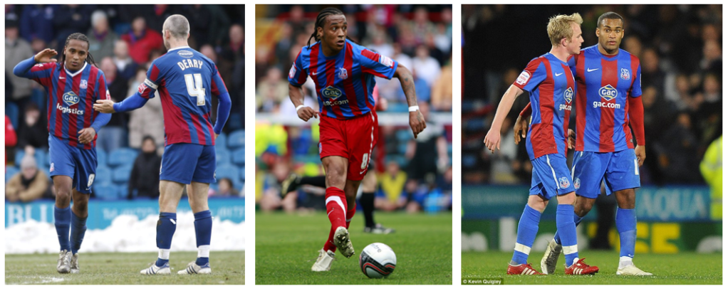
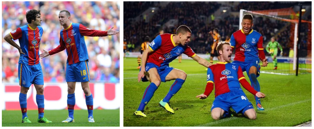
- Nike – 2009 to 2012
- Avec – 2012 to 2014
- Macron – 2014 to 2018
- Puma – 2018 to 2022
- Macron – 2022 to current season
That is a staggering 19 changes in Kit Manufacturer, with 15 different Kit Makers over a near 50 year period, so you can see why Crystal Palace was the best place to start for a look at a club’s Kit History.
Umbro – 1975 to 1977
The first brand to be visible on the shirts was Umbro, in the two seasons that Classic English Manufacturer provided Kits we saw the two classic looks that The Eagles are most famous for, the red / blue stripes and the wonderful white sash kit, introduced for the first time by Manager Malcolm Allison in the 1975/76 season. Something to note would be the placement of the crest and logo on the Sash Shirt, being reversed from it’s traditional placement.
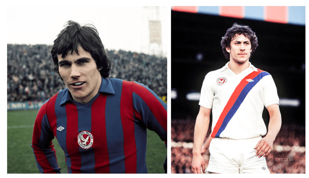
Admiral – 1977 to 1980
The next Kit Manufacturer was Admiral, this would be the first of three times they would provide Kits for Crystal Palace over the years. In this period there was very little change to the look of the Kit over the three seasons, again it was the Sash Kit to be used as the Home Kit which this time included the classic Admiral Taping on the sleeves, there were some variants of shirts with different locations of the Brand Logo.
Adidas – 1980 to 1984
For the start of the 1980/81 season it was Adidas who became the Kit provider, one of three manufacturers to have more than one stint for the club. They provided kits for four seasons in total, with the first three following the sash look, meaning this kit look was used for seven seasons in a row before a return to red and blue stripes in 1983/84, the final season for this Adidas run!

Hummel – 1984 to 1987
It was now Danish (well German / Danish) company Hummel to take the reins from 1984 and it was return to sash kit as the Home Kit, with the classic Hummel Chevrons on the sleeves. Through-out the three seasons, there was no change to actual kit, however there was a change of sponsorship during this time, which each of the three seasons having three slightly different looks, 84/85 had no sponsorship… however it is the 86/87 version that I am drawn to the most, with an interesting and unique sponsor placement on the shirt.
Admiral – 1987 to 1988
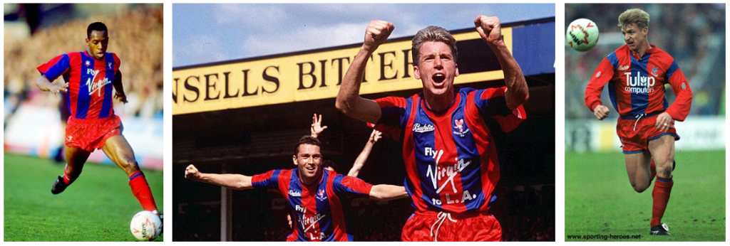
The return of Admiral for their second time in supplying kits also brought a return to Red / Blue Stripes as the Home Kit look, a change from their previous incarnations of this look though was in the shorts and socks, with Red being the first choice colour for these elements of the kits. Although Admiral only returned for a single season, there appears to be two sponsors used in this season, with the second of these being a classic Crystal Palace Sponsor, Virgin Airlines with their tagline “Fly Virgin”.

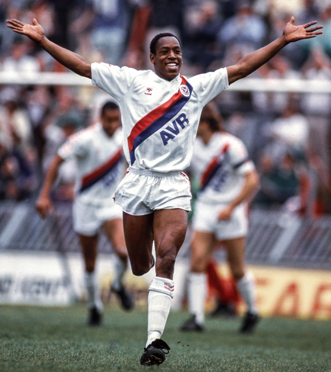
Bukta – 1988 to 1992
Bukta became the fifth Kit Manufacturer for The Eagles, and this provided a couple of kits over the four years… with a slight change in the kits between 1988 and 1990, with the Bukta Brand Logo being updated between these two seasons, the second kit seen gave us a change in the order of the stripes, with Blue being the central stripe from 1990/91 season, the first time since the Mid 70s.
Ribero – 1992 to 1994
A rare occurrence happened in December 1992, when Ribero took over from Bukta in supplying the kits mid-season. However the first kit, there was minimal chanage to the previous 92/93 shirt, with some change to design of the shorts / socks. The following season, saw what was the only Ribero designed kit produced for the club, with a return of red being the central stripe!

Nutmeg – 1994 to 1996
Another 90s Brand was used for two seasons, from 1994… in their first season Nutmeg changed very little from the previous kit incarnation but their second kit from 95/96 season was a shift in look and design, firstly introducing white trim to the central red stripe but also had the blue strips fade into the overall red look of the shirt, there was also an interesting placement of the manufacturer logo, which being below the sponsor also meant is was on the navel of the players!

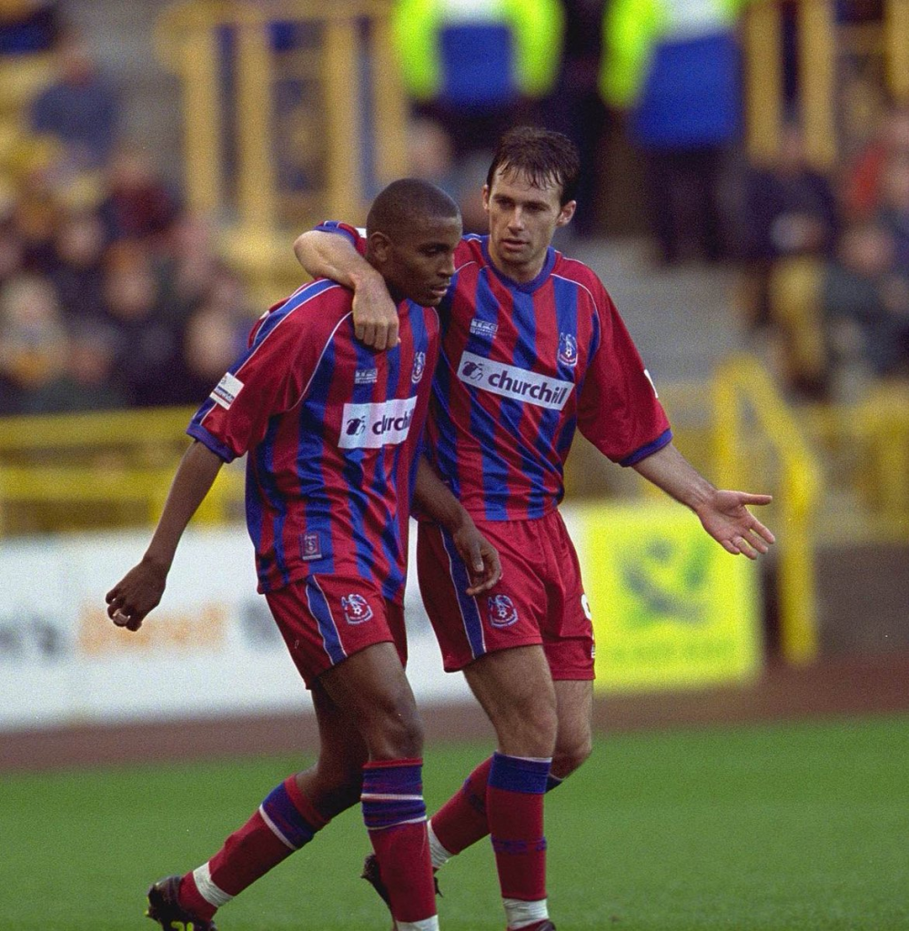
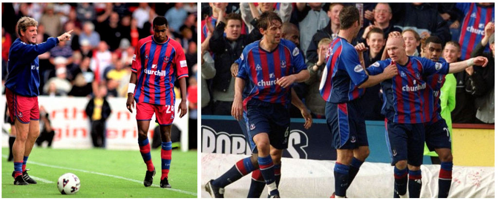
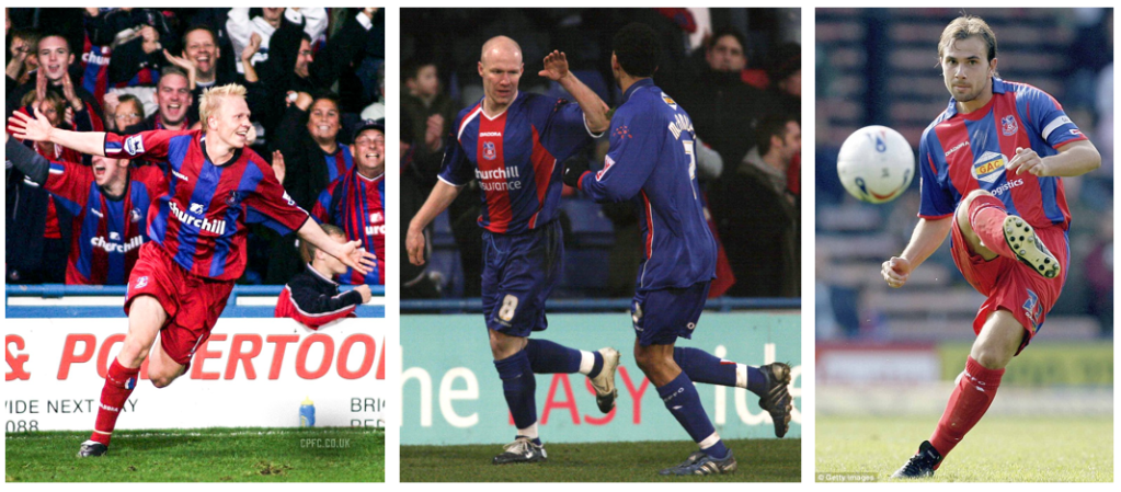
Adidas – 1996 to 1999
The return of Adidas for Crystal Palace, provided two very distinctive and two very different looks not seen yet in the club’s history.
The first kit was used for two seasons between 1996 / 1998 and saw a return to slimmer more standarised red and blue stripes, although not new for The Eagles, this kit was paired with white shorts and socks in its look (The shirt being the same one one worn by Adidas Giants Bayern Munich in 96/97 season).
The second kit, worn in 1998/99 season saw a predominantly red kit, with just blue side panels and white Adidas stripes heavily featuring in the kit.

TFG Sports – 1999 to 2001
TFG Sportswear, a South Africian sportswear manufacturer were the kit makers through the turn of the century for Palace. They provided kits for two season, but it was just the one home kit used through that time and was a return to a more classic red / blue striped shirt paired with red shorts and socks, this was the last time a kit was used for more than one season by the club.
Le Coq Sportif – 2001 to 2003
The Classic French Manufacturer was next to provide kits, again for a two year period, however this time we did see two different kits in these two seasons.
The 2001/02 shirt had red sleeves being used along with red shorts and red socks containing a large blue band and cuffs, to provide a balanced look.
The 2002/03 version was a very different look, with navy blue being added to the colour palette. There were blue sleeves on this shirt but shorts and socks were navy blue with red / blue details.
Admiral – 2003 to 2004
The return of Admiral for their third and final stint as Kit Provider, however as in their previous return it was for the single season but this gave us one of the most interesting in overall design for a Home Kit in the Club’s History.
Mantaining the use of Navy Blue in the kit from the previous season, the red and blue striped shirt added navy in the shirt’s side panels but also introduced red and blue stripes in the shirt’s sleves and into the shorts trim, add some white pipping and there is a lot going on here, but I will be honest one of my favourite kit looks for The Eagles!

Diadora – 2004 to 2007
The Tenth Kit Manufacturer on our list, is Diadora with the Italian company providing kits over three season, with a new look for each season!
Navy being ditched (well apart from the collar) in the 2004/05 Kit, for a return for a more classic Crystal Palace look.
In 2005/06 the predominance of blue was the choice of design with thicker central red stripe and red side panels, the final Diadora Kit was a return to red shorts and socks, but the thicker stripes remained with blue being the central stripe here.
It is also worth mentioning that Diadora also produced a fourth Home Kit design, this one was the Centenary Celebration Kit worn a handful of times in 2005, which was inspired by the colours first use by the club (claret and blue) with another classic all white look used by The Eagles.
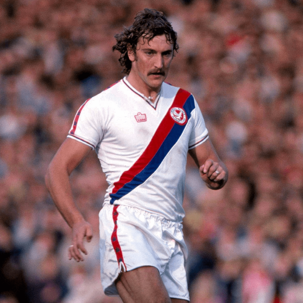
Errea – 2007 to 2009
Another Italian maker was next to be provide Kits for Palace. Errea was used for two seasons, the first providing a unique take on the red and blue stripes, with the stripes being of different lengths to give the illusion of inverted triangle within the shirt’s design.
For the 2008/09 it was a return to the Sash Kit as the first choice Home Kit the first time since 1986/87 season 21 years earlier, with nice use of red / blue trim in the shorts and socks. Although appearing several times as a change kits design option, this is the last time the look has been used as the Home Kit.

Nike – 2009 to 2012
It was Nike’s turn to provide the Kits in 2009. Over the three seasons they supplied Crystal Palace, it was very much Teamwear kits on show.
The 2009/10 version was paired with blue shorts and socks, in the shirt there was no central stripe this time something not seen before from what I can tell, the white collar did also add something slightly different to look here.
In 2010/11 season red short and socks returned, along with the central stripe on the shirt, this was the last time that red shorts and socks have been used as first choice.
The 2011/12 Kit bounced the blue shorts and socks back, the shirt also returned thicker stripes with a jagged pattern to them.
Avec – 2012 to 2014
The Kits between 2012 and 2014 were interesting, although produced by Avec they did not carry the manufacturers logo on the shirts, only on shorts and socks.
The 2012/13 version had “Founded 1905” in place of the logo, and provided a design that containted two thick red stripes, with red sleeves and introduced yellow as a trim colour through-out the kit, the stripes in this shirt are influenced from the shirts from the earlier 70’s which used the same style of thick stripes.
The second kit produced provided a first in the club’s history with a halved red and blue shirt whilst maintaining the yellow collar, with adding yellow cuffs for the first time.
Macron – 2014 to 2018
Another Italian Kit Manufacturer in Macron became provider in Summer of 2014 and would supply kits for the next four seasons, with new kits in each of these.
2014/15 continued the recent trend with yellow detailing / trim but returned to a more classic red and blue striped kit.
2015/16, again saw the removal of a central stripe to give an appearence of almost a halved shirt with alternate red and blue sleeves.
2016/17 was another change in look, this time it was almost an Ajax style kit in it’s design, with blue making the body of the shirt flanked with red side and sleeves,
The final Macron Kit in this run in 2017/18 went back to classic stripes, with a blue central stipe, all four kits being paired with blue shorts and socks.

Puma – 2018 to 2022
Crystal Palace completed being supplied by the “Big Three” Kit Manufacturers when Puma supplied their kits, another four year deal with four Home Kits over the four seasons but four very different looks used.
2018/19, an interesting design with the red stripes fading into the blue to blend into the blue shorts, yellow remained as the trim colour within collar and cuffs.
2019/20, another new element introduced into the kit, with a white pinstripe added to the blue stripes to give a classy look to the shirt, a nice pair socks also added to the overall kit look, working with the overall kit balance.
2020/21, white was removed from the kit (aside from logos), and the red central stripe returned for the first time in 10 years but this time the stipes were used to create a central point, with blue sleeves and chest panel… using the stripes in another way that worked well.
2021/22, the most radical of the Puma designs, with a diagonal take to the stipes paired with red sleeves.

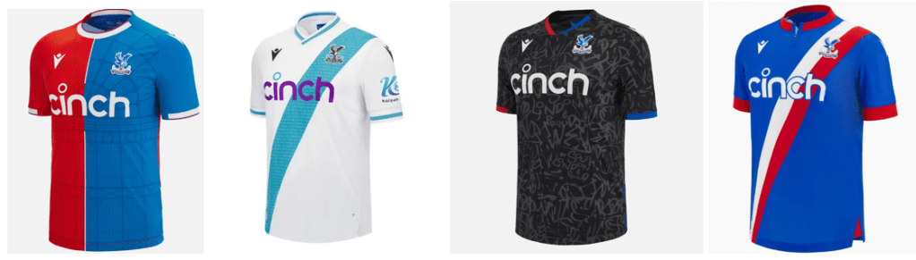
Macron – 2022 to current season
Marcon, the third manufacturer to have more than one stint as kit makers for Crystal Palace returned in 2022.
2022/23 Kit provided another interesting take on stripes, with “scribbled” effect working well and giving us something new in it’s design.
That finally brings us to this season’s kit, and a return to a halved shirt after ten years since its first appearence in their Home kit design, this shirt contains some fantastic detailing of the design of the Original Crystal Palace building and one of my favourite Home Kits in the Club’s history.
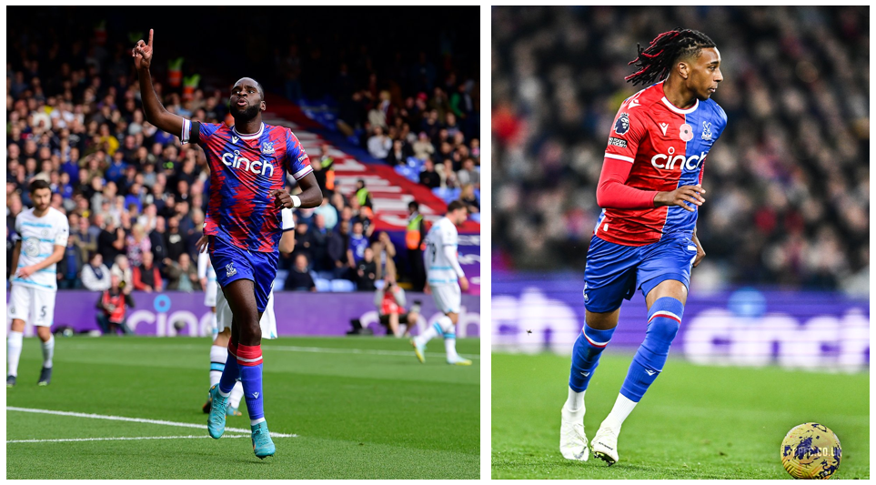
2024/25 – Macron have delivered some interesting designs in their second spell with the club and the 24/25 Kit is the most “out there” effort, combining the traditional red and blue stripes with a repeating pattern of the Club’s Eagle crest, the pattern also is used in the shorts and the overall design gives a feather effect into the kit, a brave choice but one that I think works well, it stands out and is something a little different, whilst maintaining the club colours.

There we have it, 49 years, 41 kits, 15 manufacturers… what are you favourite Crystal Palace Kits from over the years and what clubs would you like to see feature in future Kit History Deep Dives, let me know at @Kit_Geek or in the comments below.

As part of my research of this article I used the following for sourcing information:
- True Colours : Volume Two
- Historical Football Kits
- Crystal Palace Website