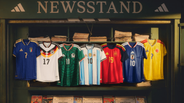
The World Cup is well and truly underway, we have now seen each of the 48 Nations take to the field, so time to have a look at the kits worn so far by each of the teams.
The use of “Home” and “Away” kit labels are do not feel right when it comes to International Tournaments, I will refer to them as “Primary” and “Secondary” choice kits.
Overview of Kits
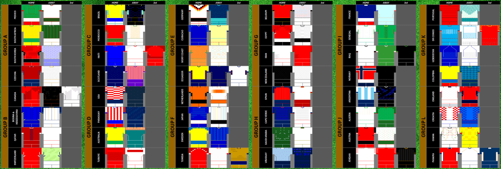
A few stats….
For the total of 48 kit appearances, we have seen “Primary” Kits (and variations) used 87.5% and “Secondary” kits (and variations) used 12.5% of the time, with only four Nations in their secondary kit!
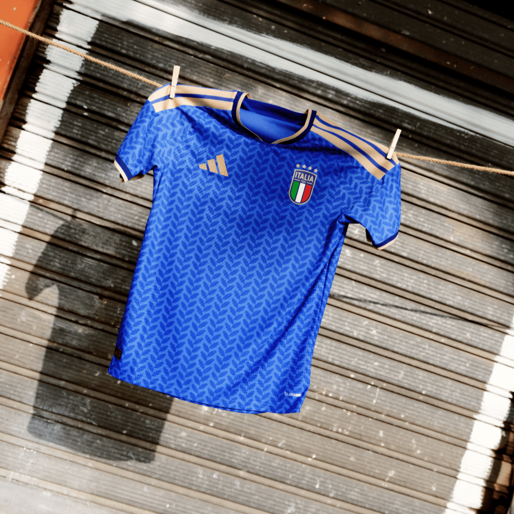
Primary – 34
Primary variations – 8 (South Africa, USA, Curaco, Netherlands, Uruguay, Senegal, Norway, Argentina)
Secondary – 14
Secondary variations – 4 (Scotland, Ecuador, Egypt, Colombia)
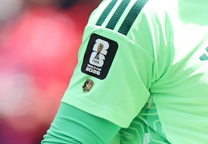
One of the first things to call out are the use of patches by the teams, there are several different patches used by the nations, players and for each game.
Teams will wear patches in black or white on their right arm, it appears nations will these patches on Primary and Secondary Kits with alternative used on each, for example…. a nation will wear the white patch on their Primary Kit and Black Patch on their Secondary Kit.
Past winners will have Gold Patches, these six nations again will rotate, gold and white / gold patches with Primary and Secondary Kits.
The Left Arm will have unique patches for each game in tournament, with messages in different colours for each of the game as we move through the tournament.
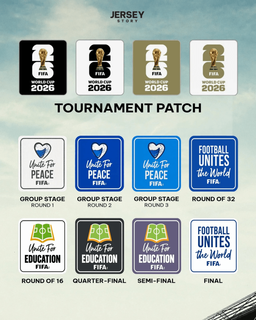
There are other patches, which appear to be “stickers” on player shirts.
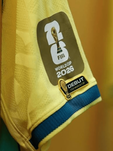
Players making their debut at the World Cup, will wear this patch.
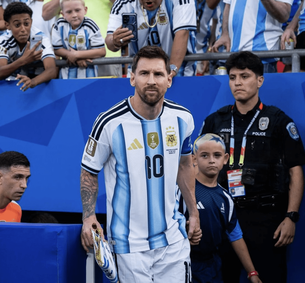
There are also personal awards being worn as patches, Thibaut Courtois wore a “golden glove” patch on his for winning the award in the 2018 Competition.
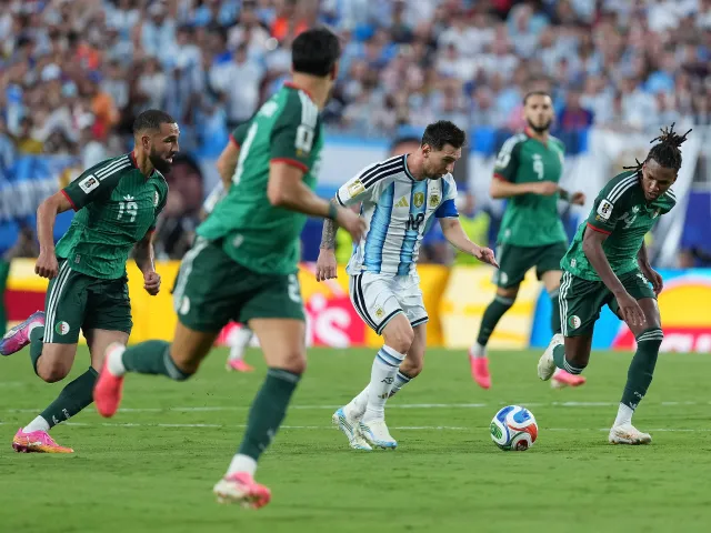
Lionel Messi wore two patches on his shirt, a “Legacy” patch to celebrate becoming the first male player to play in 6 different World Cups and a bagde (under his captain’s armband) for this player of tournament wins (2014 / 2022).
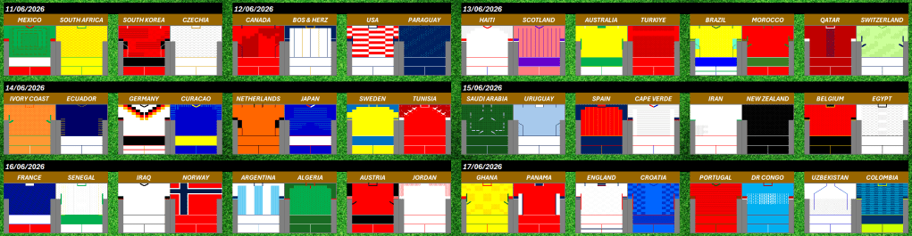
Match 1 Fixtures
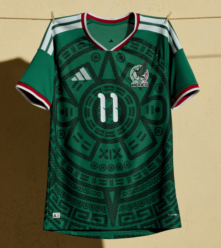
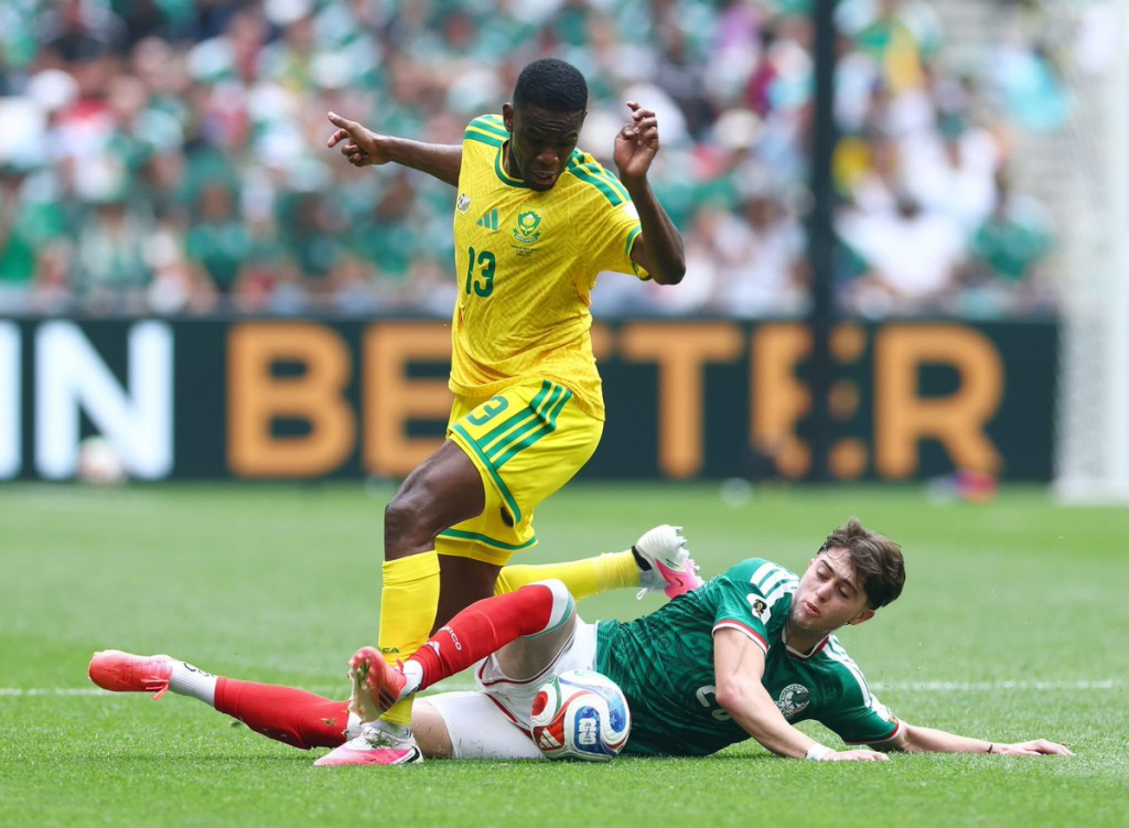
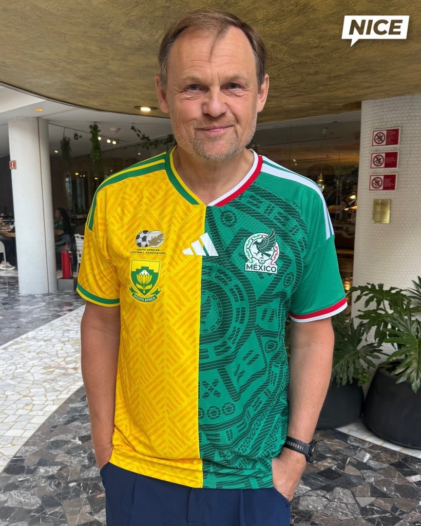
In the opening game between Mexico and South Africa, the South Africian team wore alternative yellow shorts with their Primary Kit, these are bespoke pair of shorts, as their secondary shorts are white (and Adidas Trefoil branded).
Adidas CEO, Björn Gulden “celebrated” the start of the World Cup by wearing a “half and half” shirt of the two teams in the opening fixture. This is very much considered to be a one off to kick the World Cup off!
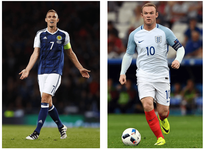
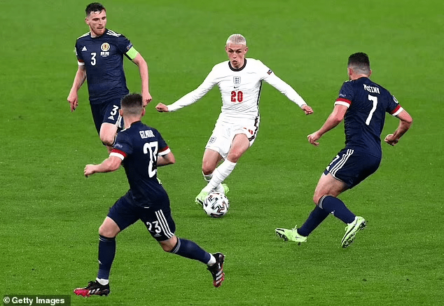
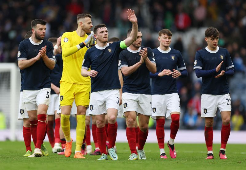
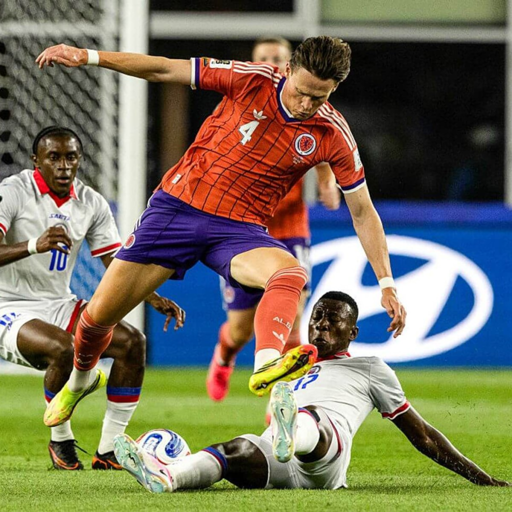
The much anticipated return of the Adidas Trefoil to the International Stage is happening in this tournament and the first team to wear their change kit containing the logo was Scotland, in their victory against Haiti in Foxborough, MA. They wore the Kit with alternative “salmon” socks.
Ecuador wore a mash up of the change and 3rd Kits, wearing their Change shirt (navy) with their 3rd shorts and socks (white).
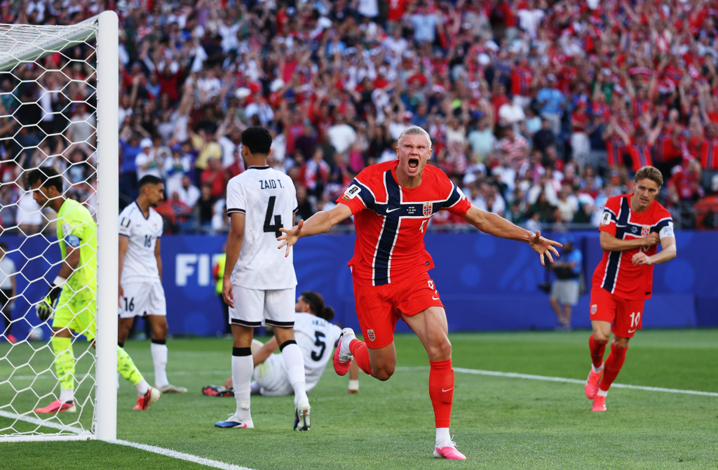
Norway wore their Primary Kit with alternative red shorts and socks, this is the 3rd different colour shorts worn with the kit in it’s short life (white as default look and Navy have been worn).
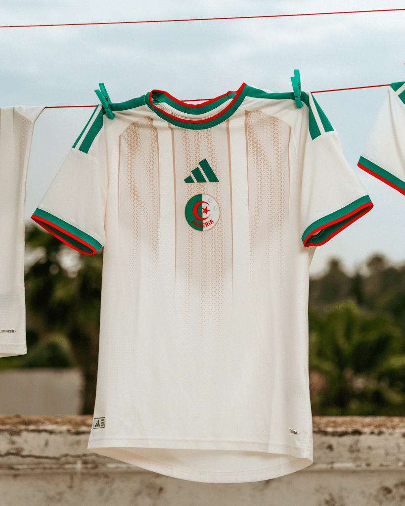
Argentina ended the 2022 World Cup wearing alternative white shorts and socks with their Primary Kit (wearing it in Quarter-Finals, Semi-Finals and the Final), a look they kicked off this tournament in, which was a surprise as the much leaked kit document had the holders in their default look with Navy Shorts and socks and opponents Algeria in white shorts / socks.
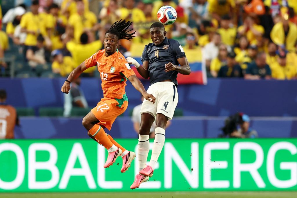
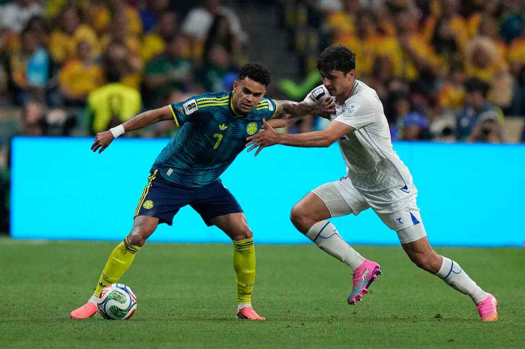
Colombia against Uzbekistan saw both Nations in change kits, with Colombia wearing alternative fluorescent socks with their Change Kit.
That’s it for the first round of fixtures, we will be back next week with the second games in each of the groups. Let me know your thoughts and comments over at my socials.