The Heat Press: England Kits 2026 / 27

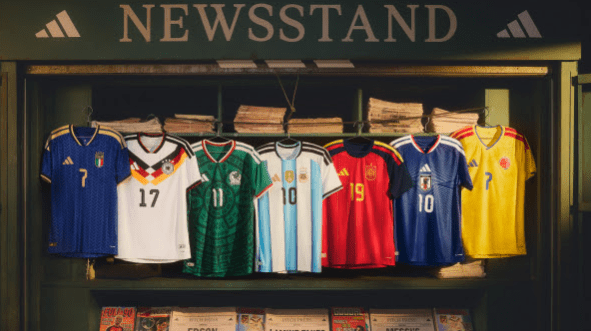
It is that time again for The Heat Press to fire up, as we take a more detailed look at the new England Kits for 2026 / 26 released by Nike on Friday 20th March 2026, all set for the forthcoming World Cup in June.

Nike have been Kit Manufacturer for The Three Lions since 2013 and these kits are seventh set of kits produced by the US Giants over this period with both the Home (Primary) and Away (Secondary) kits released at the same time which is now the standard for Nike’s International Kit Launches in a tournament year.
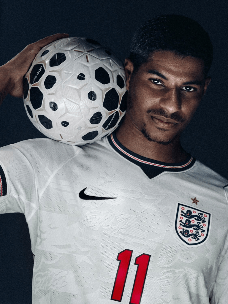
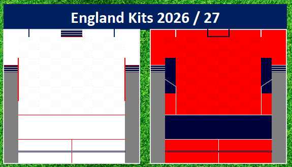
Home (Primary)

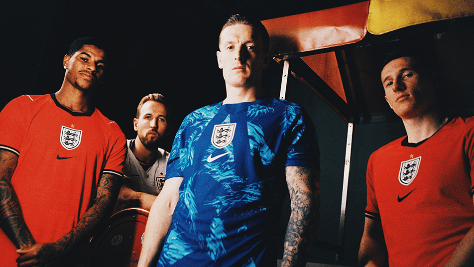
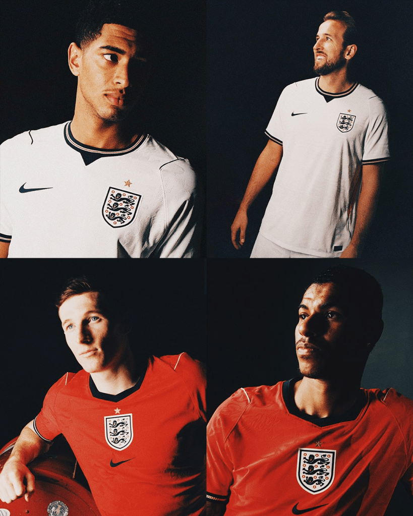
England will wear “All White” has the default look for the first time since 2014, which was the second set of Nike Kits produced for The Three Lions for that World Cup, which saw a brief directive by FIFA for countries to be in single colour blocks.

The Kit continues to have Navy Blue has one the colour details but also sees more red used as an accent colour, including the return of red names and numbers (for me something that is key in a Traditional England Kit look). The most predominant red within the shirt comes in the side panels, with red “flashes” breaking the look of the shirt nicely.

No England kit release is without some kind twist for the “traditionalists” out there, this one is going to be the shorts and the choice of white as the default look, I have no real preference in the look for the Home Kit but as will come clear later in this post, I believe this is the right choice for this kit.

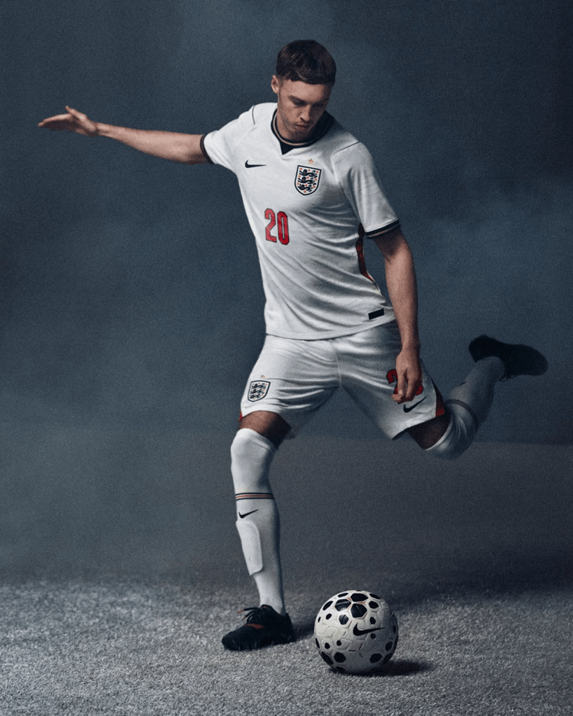
A closer look at the shirt reveals a subtle pattern using the “Three Lions”, reminiscent of that classic 1992 3rd Kit from Umbro. Another detail I really like is the collar, a return to a simple round neck collar but the navy, white, red trim is a nod to one of my favourite England Kits of all time from 1987 to 1989 with it’s “Grandad” collar. Finished off with a nice triangle insert to finish a wonderful overall look to the neckline.

Away (Secondary)

The Away sees a return to red after the previous Away Kit was “Dark Raisin”. Red was last used in 2022 (for the last World Cup), which was an “All Red” Kit. This new change kit delivers something new, navy shorts….

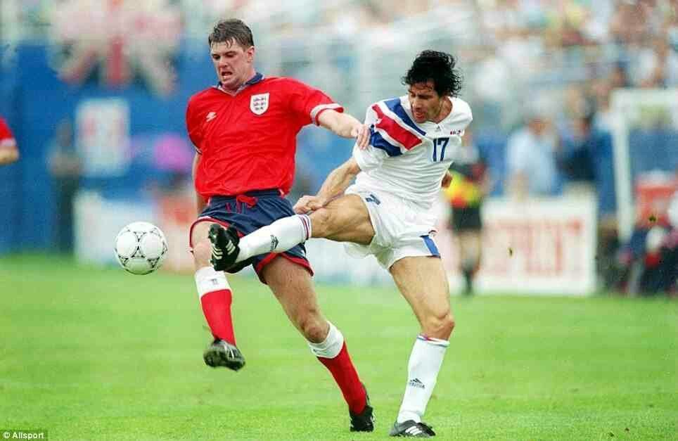
A look that England have worn three times in the past (Turkey, 1985 – New Zealand 1991 – USA 1993, see below) but these looks were all variations of the Away using Home Shorts. This will be the first time that the combination has been used by England as a default Change look.

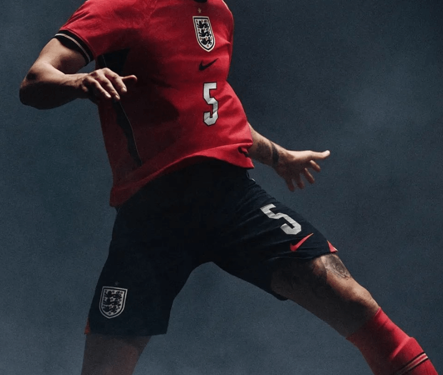
Taking a closer at the shirt, the subtle “Three Lion” pattern seen in the Home Shirt continues with this shirt, as does the trim in the cuff of the sleeves with that Navy cuff with white / red banding, another nice touch for me that ties the two kits together. The biggest change between the two shirts is the collar, with the Away have more structure, still no collar but more of an angled look rather than a “V-Neck”, a nice design choice in my eyes.

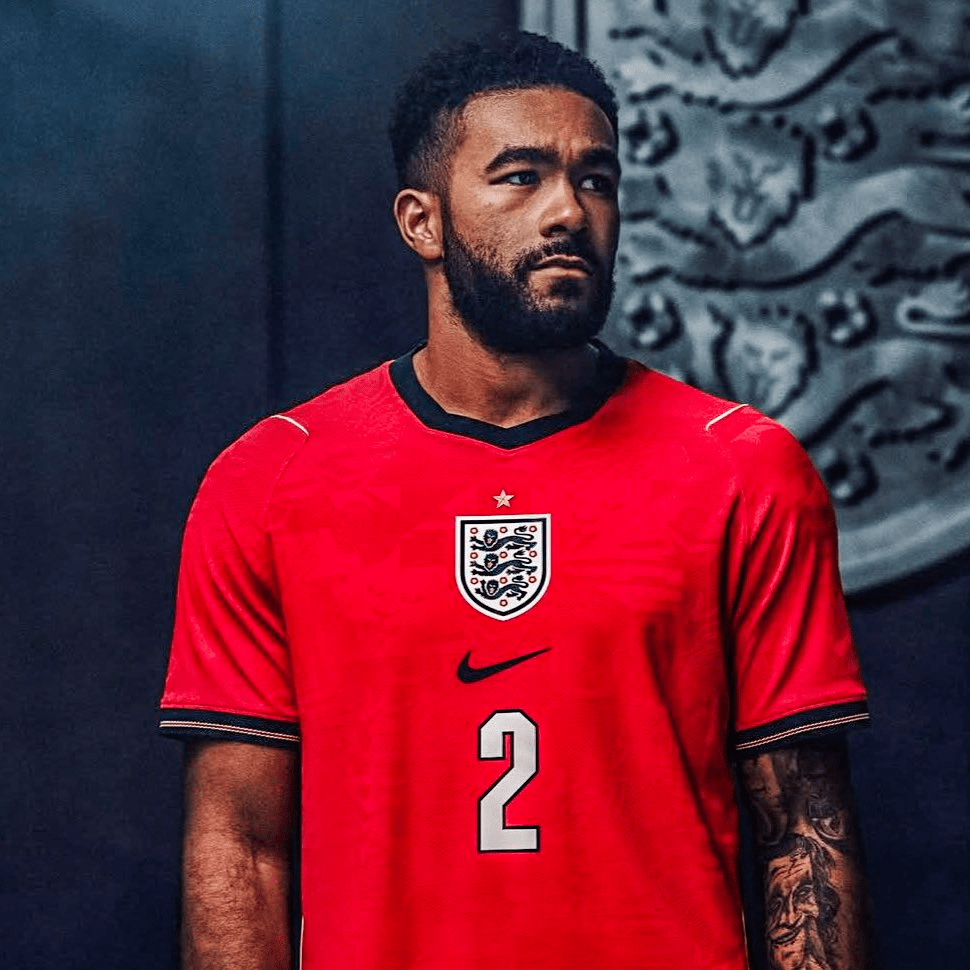
Now, those Navy shorts… I love the choice of going with this look, its new but traditional, its different but familiar, congratulations Nike on this choice, you have made this Kit Geek very happy! This shorts are great and I believe given the design of them, they can be used as alternative for the Home Kit and vice-versa, given us something we have not seen the early 90s, Kits that are truly Interchangeable, including those socks with their matching calf bands.

England last wore Red – Navy – Red in US, playing against the hosts of the US Cup in 1993

One question remains is how much use will this Away Kit get, the previous two change kits have got minimal action on the pitch, with previous (Dark Raisin) worn just three times in 2024 and not at all in 2025, and the Red Away Kit before that only being worn twice, once in 2022 and once in 2023, on top of that one of my favourite Kit Stats being that England have not worn a Change Kit in a Major Tournament since July 14th 2018, nearly 8 years.

In Summary….

I did not mind the last set of England Kits, but for me these are step up and Nike have delivered a really nice set of Interchangeable Kits for their first time, I look forward to seeing these in action in the upcoming fixtures against Uruguay (Friday 27th March) and Japan (Tuesday 31st March), with the expectation that we will see both kits in action for the first time.

There are some wonderful elements to these kits, the cuff design in both shirts is one of my favourite elements of the kits, the collar in the Home Kit, nodding back to one of my favourite England Kits of all time. The return of Red Numbers for the Home Kit, one of my Kit “Must Haves”….

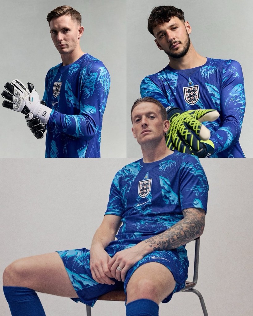
What about the Goalkeeper Kit, I have not even mentioned this but one am expecting to be as popular as the outfield shirts this summer, a design that easily be worn as leisure shirt as much as playing shirt.

In short, I am a big fan of these kits….!

Regular followers will know I track all kinds of kits in my very unique way, here is my illustration of the two kits all set for World Cup Kit Log.

The Kit is exclusive to the England Store from Monday 23rd March 2026 a few days it goes on general sale at other sites and can be purchased from here

Watch the launch video for the new England men’s kits for 2026, featuring Mike Skinner of The Streets

Please make sure you check out my England Posts, I have a full England Kit History Documented from 1960 to present day, you can find that here

What are your thoughts about the new England Kits, like or dislike?? Please let me know over at my Socials…

X – @kit_geek or Bluesky – Kit Geek

Adidas – World Cup ’26, International Kits

In terms of qualifying the “Road to World Cup 2026” is well underway, however the real start of World Cup Fever kicked off this week with Adidas launching this International Kits for the next two year cycle, so lets take a closer look at some of these kits and just for fun I have rated them!

Germany – Let’s kick off with one of the most anticipated kits, with this being the final Adidas Kit for it’s Home Nation for the foreseeable future (never say never). For me it does not disappoint and is one of the best kits of this launch, a look taking inspiration from 1990 and 1994 World Cup’s, this is going to be a hit for fans and football shirt collectors, and the long sleeve version is simply wonderful… and check the socks out, they will not disappoint!

Kit Geek Rating ⭐⭐⭐⭐⭐

Argentina – World Cup holders Argentina have a thick stripe to this shirt, the thicker Adidas Stripes (as you can see on all shirts) being black take a little some focus away from the overall look of the shirt, especially as the stripes are blue in the shorts, overall it’s OK but for me should have been better.

Kit Geek Rating ⭐⭐⭐

Spain – This is my favourite of the Adidas kits launched, a Spain shirt with a twist. The use of dark blue raglan sleeves here works really well, the Adidas stripes in the traditional Spanish colours are fantastic and are the only Country that have this take to the “3 Stripes”, the pinstripe in the body of the shirt is just subtle enough that lifts the overall look…

Kit Geek Rating ⭐⭐⭐⭐⭐

Italy – Italy have not qualified for the World Cup since Adidas has supplied their kits, so this (as long as they do qualify this time around) will be the first time The “Azzurri” have donned the 3 Stripes at this stage. Again another kit that is passable but the gold detailing does not work for me, especially with the opportunity to use the three stripes in the Italian Flag colours.

Kit Geek Rating ⭐⭐

Belgium – Belgium shirts often use different shades of red, this time is a vibrant red, paired with black and yellow detailing in collars, cuffs give a nice overall look to this kit, black shorts and socks as well and this is one of the nicest overall looks from this launch.

Kit Geek Rating ⭐⭐⭐⭐

Mexico – Returning to Green as Primary colour (as standard within World Cup Cycles), this shirt is another looking back to the 90s, with this “Aztec” pattern in the body of the shirt. Nice use of red / white within the collars and cuffs gives a nice balance to what is ticks all the boxes of what you would expect form a Mexico Shirt, but overall my least favourite of the shirts we are looking at here.

Kit Geek Rating

Japan – Adidas and Japan is often a partnership that delivers, although this shirt is fairly simple in it’s design compared to some recent years, it works in it elegance, some nice design elements, I would have like to have seen the cuffs with red / white trim (as the collar) but overall a solid kit.

Kit Geek Rating ⭐⭐⭐

Colombia – A fairly standard looking kit for Colombia, the use of red Adidas stripes and then just the blue trim within the collar and cuffs works very well in my eyes. Interesting pattern within the shirt which are “butterfly motifs inspired by magical realism”, this adds some depth to overall look.

Kit Geek Rating ⭐⭐⭐

Wales – With many kits looking to the 90s, its refreshing in some ways to see a kit that looks to the 80’s, with this Wales kit. Again using green as one of the accent colours works well and lifts the kit from standard template to something with a bespoke feel. The central chest band design element is great and this one of the few shirts that has National Crest and Adidas Logo centrally placed.

Kit Geek Rating ⭐⭐⭐⭐⭐

Sweden – I like this one, and is inspired by the 70’s (apparently). The pattern in the shirt is inspired by the “popular flower stitching found on jeans and traditional Swedish folk dresses from the era”. What works for me is the use of blue across the shoulders, not going full raglan but this use of colour and then with the white Adidas stripes works well in my eyes.

Kit Geek Rating ⭐⭐⭐⭐

Peru – The Peru kit is one that is difficult to much with given it’s iconic sash, this is a solid effort with some detailing with sash itself that is nice but the choice of design in the overall sash, making it blocky may take some getting used too, maybe they were inspired by my kit illustrations which use this look with sash shirts (of course not!).

Kit Geek Rating ⭐⭐⭐

Scotland – Adidas and Scotland is another one of the relationships that just feels right and I have really liked the kits produced in the 15 years they have been in partnership. This one is another great shirt, with a really nice subtle “Saltire” within the shirt’s body. My only complaint with the kit is the that this look is all Navy Blue, I preference is seeing Scotland in white shorts and red socks.

Kit Geek Rating ⭐⭐⭐

Algeria – The Algeria shirt is another kit that uses colours of it’s flag within the collar and cuffs, this use of green and red really lifts the shirt in my eyes. An interesting pattern with the shirt and certainly helps raise the overall look away from a standard looking template.

Kit Geek Rating ⭐⭐⭐

Costa Rica – There is plenty going on here, a vibrant looking shirt with pink detailing being inspired by “Guaria Morada orchid”, the country’s national flower. I think this shirt will prove very popular with Kit Lovers next summer, and one we will see a lot of.

Kit Geek Rating ⭐⭐⭐⭐

Northern Ireland – This is an interesting design, there is blend of green tones with a pattern inspired by the “transatlantic ships traditionally built in Belfast’s shipyards”. The look creates a halved shirt, something a little different in International Football Shirts, so I am all for those choices. Matched with green shorts and white socks, so as regular readers will know I love a contrasting sock look!

Kit Geek Rating ⭐⭐⭐

There we have it, the build up to the World Cup has started, Any thoughts and comments about these Adidas Kits please let me know over at my Socials…

X – @kit_geek or Bluesky – Kit Geek

And if you are interested in buying one of these shirts please check out the link below – https://kitbag.evyy.net/KitGeek

Premier League: Matchweek 31 Kit Review

The Premier League just has a one day break between the last game of Matchweek 30 and the start of Matchweek 31. All of the fixtures were the reverse matches from Matchweek 16

You can find last week’s report here

The Kit Overview for Premier League is below.

Matchweek 31 Fixtures

Total Kits Used

  • Kits Worn in Total – 102 (+1 New Kits this Matchweek)
  • Goalkeeper Kits – 70 (No New Kit this Matchweek)

New Kits this Matchweek

There was one new Kit this weekend.

Nottingham Forest wore their 3rd Kit with alternative sky blue shorts and alternative white socks.

Kit Highlights

Nottingham Forest have now worn their 3rd Kit in three different variations with white / sky blue shorts and socks, this was their 6th Kit look of the season so far.

Leicester City gave a debut to 15 year old Jeremy Monga, the 2nd youngest player to appear in the Premier League and due the legalities of shirt sponsorship wore a sponsor-less shirt for his first senior appearance.

Although they ended relegated this weekend, Southampton actually suffered their first defeat in the Premier League this season in their 3rd Kit, wearing 3 times so far this season (all with alternative white shorts).

My favourite Kit Match Up of this Matchweek was the game between Brentford and Chelsea, a sunny day in West London really helps these kits shine and the match up with both teams in their Home Kit worked well for me!

Kit Stats

Overall we have seen 15 Home Kits, 1 Away Kits and 4 3rd Kits

There were four Kit Variations used this Matchweek

  • Wolverhampton Wanderers – Home with alternative “Old Gold” shorts, 7th time used
  • Nottingham Forest – 3rd using both alternative sky blue shorts and white socks
  • Southampton – 3rd with alternative white shorts, 3rd time used
  • Manchester City – Home with alternative white socks, 5th time used

Kit Grid – Up to 8th April

Kit News

As there was only a day between Matchweeks, there was no new Premier League Kit News!

Let me know your thoughts in the comments below or over at my Socials…

X – @kit_geek or Bluesky – Kit Geek

If you liked this, then check out the below posts that have recently been published on the site…

Premier League – Matchweek 26

Premier League – Matchweek 27

Premier League – Matchweek 28

Premier League – Matchweek 29

Premier League – Matchweek 30

Kit History: Aston Villa

England Kit History – 2010 to 2019

England Kit History (Reference Page)