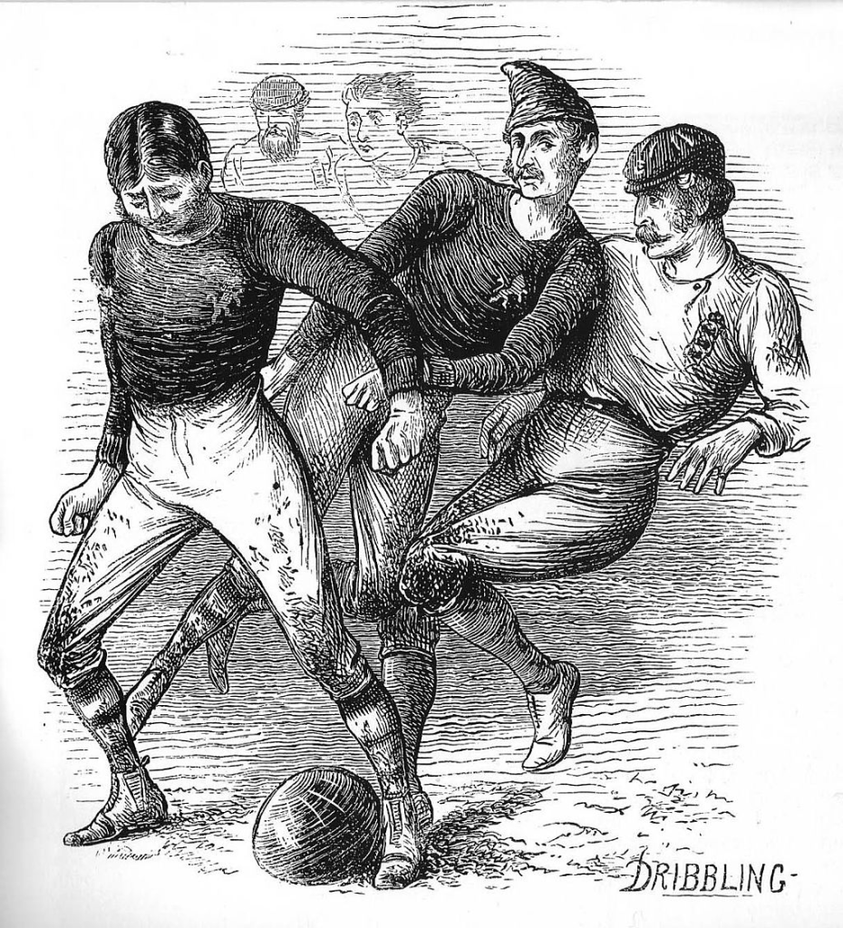
In terms of qualifying the “Road to World Cup 2026” is well underway, however the real start of World Cup Fever kicked off this week with Adidas launching this International Kits for the next two year cycle, so lets take a closer look at some of these kits and just for fun I have rated them!

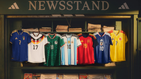
Germany – Let’s kick off with one of the most anticipated kits, with this being the final Adidas Kit for it’s Home Nation for the foreseeable future (never say never). For me it does not disappoint and is one of the best kits of this launch, a look taking inspiration from 1990 and 1994 World Cup’s, this is going to be a hit for fans and football shirt collectors, and the long sleeve version is simply wonderful… and check the socks out, they will not disappoint!
Kit Geek Rating ⭐⭐⭐⭐⭐

Argentina – World Cup holders Argentina have a thick stripe to this shirt, the thicker Adidas Stripes (as you can see on all shirts) being black take a little some focus away from the overall look of the shirt, especially as the stripes are blue in the shorts, overall it’s OK but for me should have been better.
Kit Geek Rating ⭐⭐⭐

Spain – This is my favourite of the Adidas kits launched, a Spain shirt with a twist. The use of dark blue raglan sleeves here works really well, the Adidas stripes in the traditional Spanish colours are fantastic and are the only Country that have this take to the “3 Stripes”, the pinstripe in the body of the shirt is just subtle enough that lifts the overall look…
Kit Geek Rating ⭐⭐⭐⭐⭐

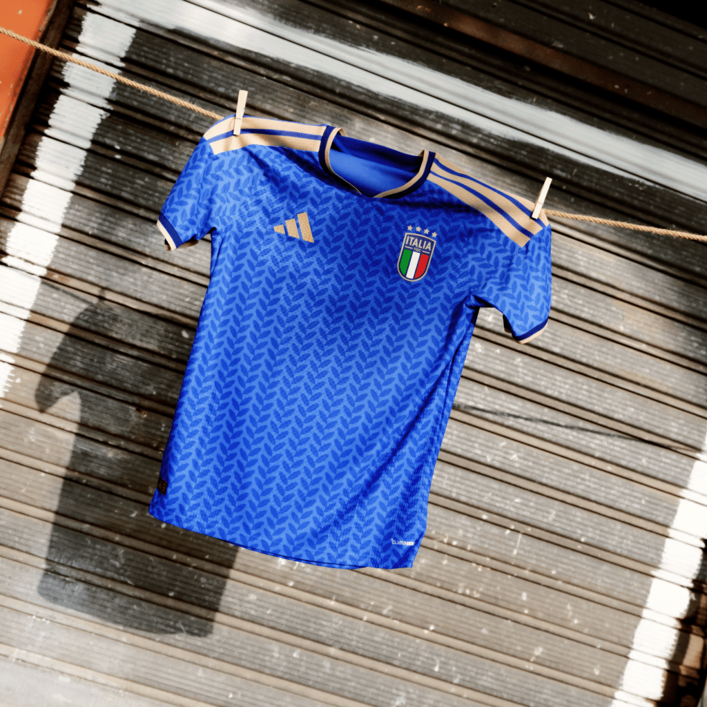
Italy – Italy have not qualified for the World Cup since Adidas has supplied their kits, so this (as long as they do qualify this time around) will be the first time The “Azzurri” have donned the 3 Stripes at this stage. Again another kit that is passable but the gold detailing does not work for me, especially with the opportunity to use the three stripes in the Italian Flag colours.
Kit Geek Rating ⭐⭐
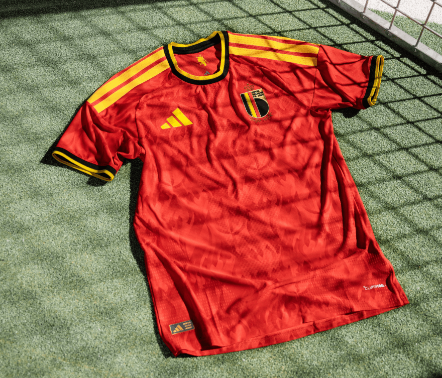
Belgium – Belgium shirts often use different shades of red, this time is a vibrant red, paired with black and yellow detailing in collars, cuffs give a nice overall look to this kit, black shorts and socks as well and this is one of the nicest overall looks from this launch.
Kit Geek Rating ⭐⭐⭐⭐
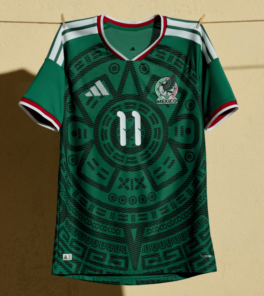
Mexico – Returning to Green as Primary colour (as standard within World Cup Cycles), this shirt is another looking back to the 90s, with this “Aztec” pattern in the body of the shirt. Nice use of red / white within the collars and cuffs gives a nice balance to what is ticks all the boxes of what you would expect form a Mexico Shirt, but overall my least favourite of the shirts we are looking at here.
Kit Geek Rating ⭐
Japan – Adidas and Japan is often a partnership that delivers, although this shirt is fairly simple in it’s design compared to some recent years, it works in it elegance, some nice design elements, I would have like to have seen the cuffs with red / white trim (as the collar) but overall a solid kit.
Kit Geek Rating ⭐⭐⭐

Colombia – A fairly standard looking kit for Colombia, the use of red Adidas stripes and then just the blue trim within the collar and cuffs works very well in my eyes. Interesting pattern within the shirt which are “butterfly motifs inspired by magical realism”, this adds some depth to overall look.
Kit Geek Rating ⭐⭐⭐

Wales – With many kits looking to the 90s, its refreshing in some ways to see a kit that looks to the 80’s, with this Wales kit. Again using green as one of the accent colours works well and lifts the kit from standard template to something with a bespoke feel. The central chest band design element is great and this one of the few shirts that has National Crest and Adidas Logo centrally placed.
Kit Geek Rating ⭐⭐⭐⭐⭐

Sweden – I like this one, and is inspired by the 70’s (apparently). The pattern in the shirt is inspired by the “popular flower stitching found on jeans and traditional Swedish folk dresses from the era”. What works for me is the use of blue across the shoulders, not going full raglan but this use of colour and then with the white Adidas stripes works well in my eyes.
Kit Geek Rating ⭐⭐⭐⭐

Peru – The Peru kit is one that is difficult to much with given it’s iconic sash, this is a solid effort with some detailing with sash itself that is nice but the choice of design in the overall sash, making it blocky may take some getting used too, maybe they were inspired by my kit illustrations which use this look with sash shirts (of course not!).
Kit Geek Rating ⭐⭐⭐

Scotland – Adidas and Scotland is another one of the relationships that just feels right and I have really liked the kits produced in the 15 years they have been in partnership. This one is another great shirt, with a really nice subtle “Saltire” within the shirt’s body. My only complaint with the kit is the that this look is all Navy Blue, I preference is seeing Scotland in white shorts and red socks.
Kit Geek Rating ⭐⭐⭐

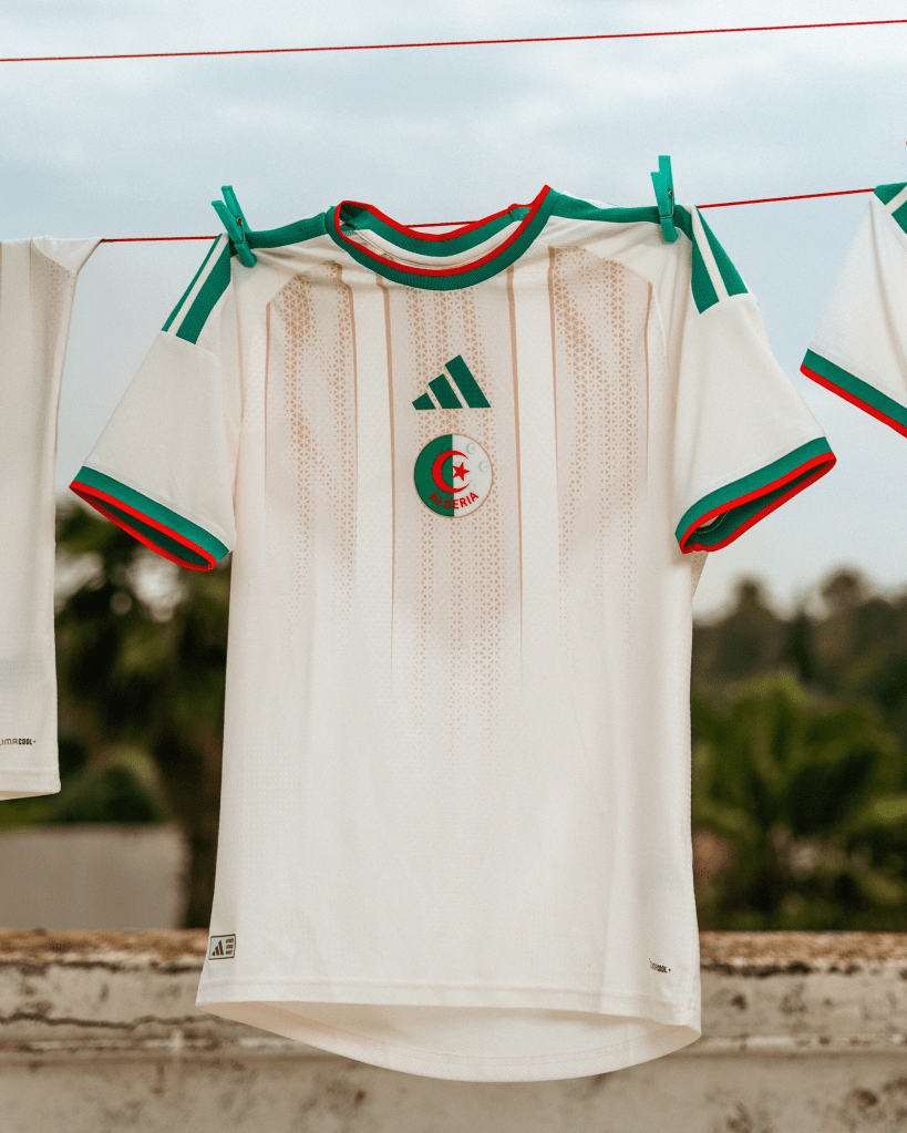
Algeria – The Algeria shirt is another kit that uses colours of it’s flag within the collar and cuffs, this use of green and red really lifts the shirt in my eyes. An interesting pattern with the shirt and certainly helps raise the overall look away from a standard looking template.
Kit Geek Rating ⭐⭐⭐
Costa Rica – There is plenty going on here, a vibrant looking shirt with pink detailing being inspired by “Guaria Morada orchid”, the country’s national flower. I think this shirt will prove very popular with Kit Lovers next summer, and one we will see a lot of.
Kit Geek Rating ⭐⭐⭐⭐

Northern Ireland – This is an interesting design, there is blend of green tones with a pattern inspired by the “transatlantic ships traditionally built in Belfast’s shipyards”. The look creates a halved shirt, something a little different in International Football Shirts, so I am all for those choices. Matched with green shorts and white socks, so as regular readers will know I love a contrasting sock look!
Kit Geek Rating ⭐⭐⭐

There we have it, the build up to the World Cup has started, Any thoughts and comments about these Adidas Kits please let me know over at my Socials…
X – @kit_geek or Bluesky – Kit Geek
And if you are interested in buying one of these shirts please check out the link below – https://kitbag.evyy.net/KitGeek