Premier League Kit Log – END OF SEASON UPDATE

We’ve made it, we are there…. 380 games completed, 20 teams with 59 kits between them and 95 variations of those kits worn a total of 760 times (but more about that later)….

On Sunday 13th May saw the 2018/19 season come to a close, with Manchester City breaking all kinds of records on the pitch but what we are interested in looking at here is who wore what when, so Ladies and Gents, I give the Premier League 2018/19 completed Kit Log…. enjoy!

To make it easier to view, I have broken it down into four sections, 10 teams in alphabetical order  in each section and looking at Matches 1-19 and Matches 20-38.

Arsenal to Liverpool, Matches 1 to 19

EPL_a

Arsenal to Liverpool, Matches 20 to 38

EPL_b

Manchester City to West Ham United, Matches 1 to 19

EPL_c

Manchester City to West Ham United, Matches 20 to 38

EPL_d

Looking at some of the kit stats:

Home Kits – 552 used, 73% (65% full home kit, 8% home kit variations) 

Away Kits – 134 used, 17% (14% full away kit, 3% away kit variations)

3rd Kits – 74 used,10% (8% full 3rd kits, 2% 3rd kit variations)

I will be following this post up in the next days looking at the variations of kits used in more detail.

Oh and my favourite kit of season, the variation used by Southampton at Newcastle United, red shorts, red socks worn but also changed the back of the shirt to make it solid red as well to avoid a clash, a real one for us Kit Geeks out there…..

Soton

Kit Log – World Cup, Korea/Japan 2002

For the first time in the competition’s history the World Cup moved away from Europe and Americas and was held on Asian Continent, the 17th Tournament hosted by both South Korea and Japan, which also was another first with a jointly hosted competition.  Following from France 98, the format remained the same and gave us 32 teams competing in 8 groups of 4 teams, followed by knock out stage of the competition, totaling in 64 games.

In terms of the kits seen in the tournament, there was a real identity per manufacture, I do not want to use the word template as there were some subtle differences with the shirts that made them a little for unique than a standard template, in particular with those Nations that had Nike kits in 2002.

Looking at the manufacturers, again as in France 98 there was 12 manufacturers on show at the tournament, Adidas leading the way once more but there was an increase in the number of teams wearing the three stripes, with 10 from the 6 from four years earlier.  Nike had 8 representative and Puma 4, so the “Big 3” making up nearly 70% of the nations appearing.  There were some notable manufacturers in the rest of the kit suppliers, Kappa, Hummel, Le Coq Sportif, Joma, Umbro (who supplied England and Ireland) and Uhlsport.  There were some lesser known names in Marathon, L.Sporto and Athletica, supplying some of the Central and South American Nations.

korjap_1

It was certainly a bright World Cup in terms of colours, Nike’s Nigeria and South Korea kits were reminiscent of highlighter pens, in particular the Nigerian Kit which in the first game was paired with white numbers and names, which proved not to be that visible to watching millions and was quickly replaced by black alternatives for the rest of the competition.

Almost all Nations had a splash of colour or detailing on their shirts, one notable exception to this was Italy, whose Kappa kit stood out as a classic Italian Shirt, a lighter shade of blue used, a balance in the first and second choice kits topped off with a more tighter cut than other kits used – certainly not a kit with those with kind of build that I have.

korjap_2

Another kit to call out and look into a little more detail is Cameroon’s kit, here they (or Puma) looked to do something different and never seen before, to combat the heat and humidity they proposed a sleeveless kit and in fact used a sleeveless version of the kit they wore prior to the tournament, however FIFA did not allow this kit to be worn in the actual tournament and black sleeves were added to both the first and second choice shirts.  Cameroon would try to break kit boundaries two years later with an all in one kit.

korjap_3

Eventual winners Brazil, wore their traditional yellow shirt with three different combinations of shorts and socks, the classic blue shorts and white socks against Chine and Turkey (twice, group and semi-final), white shorts and blue socks against Costa Rica and blue shorts and blue socks in the final against Germany, a rarely seen variation of the kit which will go down in history as it was the one worn to lift the trophy for a record 5th time.

Feel free to share your kit highlights from 2002 World Cup.

Kit Log – World Cup, France 1998

The 16th World Cup headed back to Europe and returned to France after they held the 1938 tournament.  This was an expanded competition from the previous three World Cups and was the first to follow the format that is now well established which meant an increase in qualifying teams from 24 to 32 teams, resulting in eight groups of four teams, with the top two teams moving on to the knock out stages, giving us a total of 64 games that were played between 10th June 1998 and 12th July 1998.

Looking at the kits, there was again a leap from USA 94 in terms of style and colours on show from each country.  Several countries added detail to their kits that had not been seen before on, Mexico, Japan, South Africa are all countries that spring to mind with added flashes of colour and detail.

FR98_1

Looking at the manufacturers, there was greater mix of supplier in this competition with 12 different manufacturers taking to the field, leading the way were Adidas wore kitted out 6 teams, a huge reduction from Italia 90 where they supplied 15 out 24 teams and new comers to International football, Nike.

The US brand’s poster boys for the tournament where holders Brazil.  Kit manufacturers using football to promote their products was about to take off….. literally, remember the advert at the Airport, if you do you’ll have that song now in your head for rest of the day.

FR98_2

Overall there was a real blend of template style kits, Adidas with Romania, Yugoslavia, Spain and Puma with Cameroon, Austria, Bulgaria and bespoke designs with Japan, Mexico, Denmark.

A special mention here has to go to Kappa for France 98, they supplied two teams, South Africa and Jamaica, the kits they produced where both unique and stood out from the rest, especially the Reggae Boys, a magnificent kit and one that I cannot do any justice with my simply illustrations.

Another “highlight” worth mentioning is something that Romania did, with most of the team bleaching their hair blonde, whether it was as part of a team unity exercise or as the late great Jimmy Hill surmised maybe would improve picking out a team-mate at quick glance (lets got with that, then it can be kit related, kinda).

FR98_3

England returned to the traditional red away kit for the tournament, it only made one appearance against Colombia but after the controversial “Indigo” away kit of Euro 96 (which I still believe to be a classic England kit) was also the kit that saw one David Beckham score his first goal for England.  In the knock-out round against Argentina, England wore an all white kit, which was a rare sight for England in the 1990’s but one that will be remembered due to one of the goals of tournament being scored by Michael Owen.

Eventual winners France, returned to a classic style and one that has been repeated several times over the years since they won 1984 European Championships in their iconic design.  It is a classic design that is synonymous with the French team and one that I am sure we will see again in the future.

Any kit highlights from France 1998, let me know?


Remembering Ray Wilkins

I was saddened to hear about the passing of Ray Wilkins, he was one of my first footballing heroes, as a child in the 80s he was one of the first players I knew that played abroad, the memories of Mexico 86 World Cup, seeing repeats of that Cup Final goal and career that went on and on both off and on the pitch.

I always enjoyed listening to him talk about the game and finding him insightful and felt like I learnt something from him.

So I want to pay my respects in the only way I know how to, in a selection of the kits he wore through-out his career, Rest in Peace “Butch”

RW_kits


England, Kit Review

I always like to see a new kit in action before making any decisions about my thoughts on it, the promotional pictures and marketing details are for me only a taster of a team or this case Country’s new wears, its when we see it action that we can see the design in all its glory.

So on Friday 23rd March, England’s Senior Men’s team kicked off in the next range of “Home” / “First” kits ready for the 2018 World Cup in Russia.

eng_team

My first impression from its initial launch was that this a return to a more conservative approach to kit design, the previous kits which for full disclosure I was a fan of and thought was a great effort at something different for England.  However this is more of a classic “England” design, seeing a return to the blue shorts, the first time since 2013/4 kit (the first Nike design had England had).  These short are one of the aspects of this kit which I really like, the detail in the shorts with the “Tonal” England crest and Nike tick, give a nice balance to shorts and tied in with the red numbering really works for me.

England_back

The return of red numbering is one of the key elements here that I really like within this kit, probably one the designers wont thank me for but red numbering is one of the elements of an England Kit that I do not think should change. This is the first time this has been seen since the 2012 Umbro kit (the all white version with only Red design elements included) and the first time with the traditional blue shorts since Umbro’s 1999/2001 kit – I had to check and double check that, as it did not seem to be that long ago!

Other aspects of the shirt which work for are the subtle flashes of colour within the shirt, the red collar line around the neck and the Blue within the Crest also seems to the badge “pop” more than other shirt of recent years. The only thing that does not work for me is the placement of the number on the front of the shirt, I feel a more central position would balance the shirt, the number seems too low in its current spot.

Eng_front

Overall, for me this is a good look for England, a return to a more traditional look but with some nice nods to the past, as an England fan let’s hope that this kit is linked to more happier time on the pitch.

Eng

What are you thoughts on this kit?

Kit Log – World Cup, USA 1994

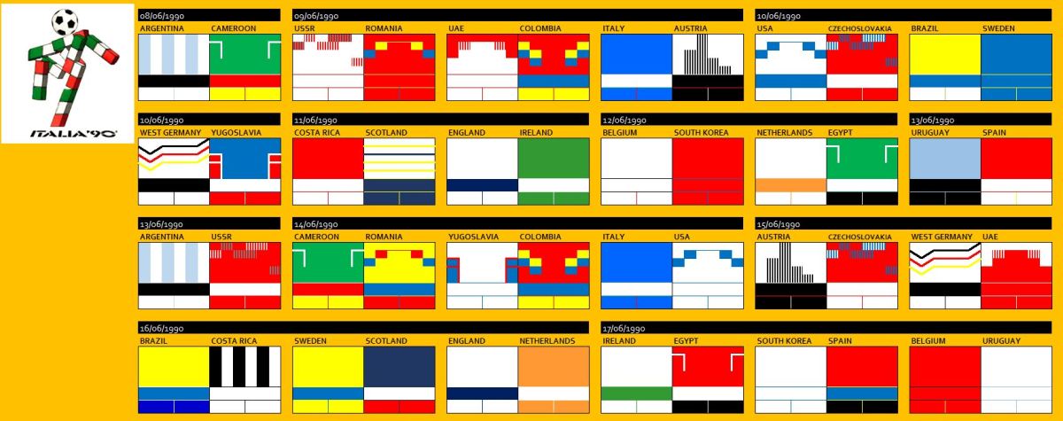
With an explosion and colour and design The 1994 World Cup rolled into new territory and into a new market when 15th Tournament headed off to the USA!

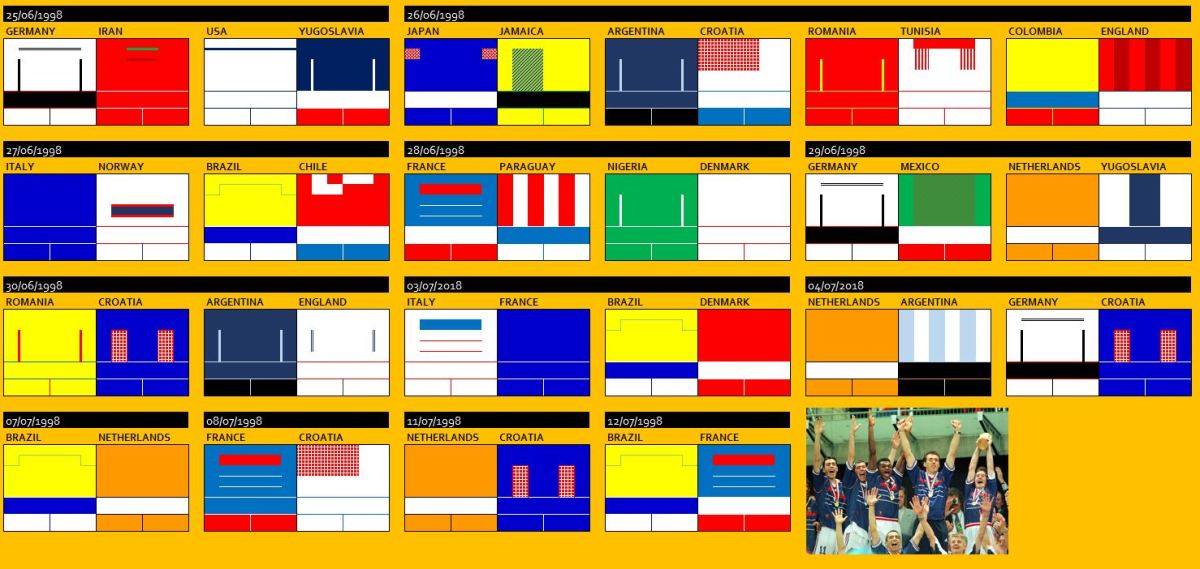
For the third time the tournament format remained unchanged which meant between 17th June and 17th July 1994 there were 24 teams taking part, split into six groups of four teams, followed by the knock out stage of competition to give us a total of 52 games to look at.

In terms of kits there was a leap from the 1990 World Cup in terms of designs, almost all kits had some form of added splashes of colour (for example, the Adidas three strips in Sweden, Bulgaria, Romania), design element (seen with Nigeria, South Korea, Morocco) and even the plain kits had elements of water mark contained within the shirt (think Netherlands, Italy, Brazil).

USA94_1

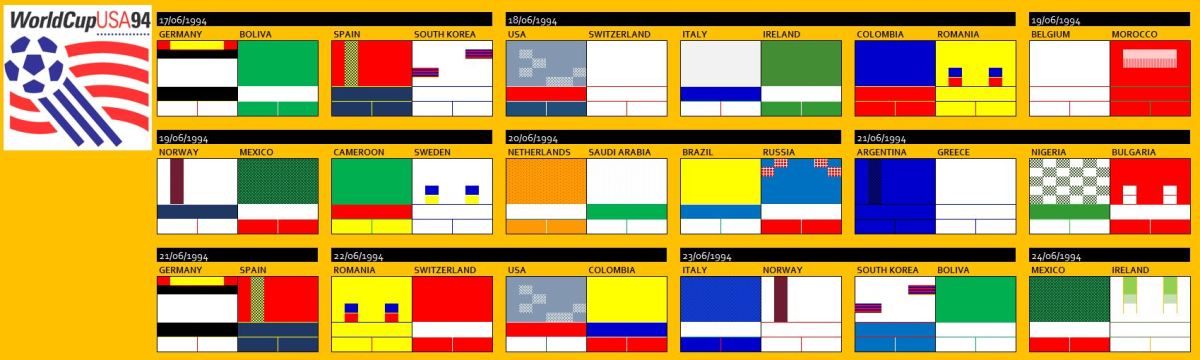
In terms of manufacturers, Adidas again led the way supplying the most teams playing but their number declined from 1990 World Cup where they had 15 countries in their ranks, this time round they had 10 countries.  Umbro appear next on the list supplying 4 countries, all from Central and South America, something of surprise with a brand that is historically linked with the Home Nations. Other brands such as Lotto, Diadora, Reebok, Mitre also graced the field but there were significant absentees from the manufacturers that we see today in Puma and Nike, who where to enter the market in big way after this tournament.

USA94_2

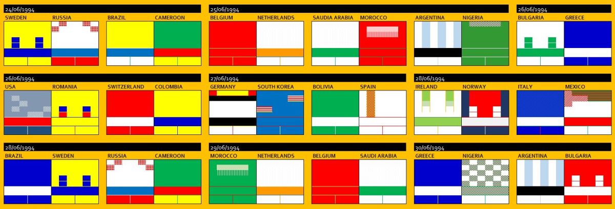
We need to talk about Adidas, wow…. in my opinion some of their greatest designs appeared at USA 94 and none more-so than the hosts themselves.  USA’s classic “Stars” and “Stripes” kits, which I think should be discussed as a pair, as they were seamlessly interchangeable with their respective shorts and socks, any combination which they took to the pitch just worked beautifully, in their 4 games they used 3 different combinations of kit, a true World Cup classic kit up there with Denmark in 1986 – click here for that tournament’s kit log

Other classic kits seen from Adidas were Nigeria’s second choice kit, a unique design and something that is now the inspiration behind their 2018 World Cup Kit, one of the best we have seen so far this year.  Ireland also had unique designs from Adidas and I believe these kits, particularly the away kit being underrated as one of the best away kits Ireland have had, they were also short lived designs with Ireland moving across to Umbro shortly after the conclusion of the World Cup.

Adidas also introduced some template designs which at the time I did not like but have grown on me over the years, particularly Sweden’s away kit and Argentina’s away kit, although when I think of that kit I have an image of Maradona screaming into the camera after scoring (the less said about that the better).

USA94_3

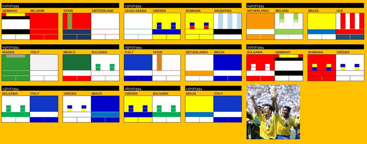
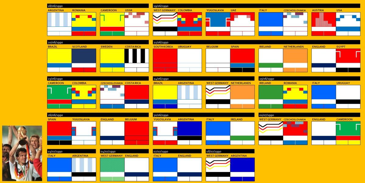
There was some unusual sights in both Quarter-Finals and Semi-Finals, where there games with both teams wearing the “away” strips, Netherlands v Brazil, Romania v Sweden and Sweden v Brazil, a common theme of yellow there but after looking into the reason behind this, there is no clear reason why this choice was made, if anyone has any thoughts or ideas about this please let me know.

Eventual winners, Umbro wearing Brazil wore they home kit 4 times including the final and away 3 times, where they combined the away shirt and socks with home shorts to give us a smart all blue (although slightly different shades blue, ahead of their time?) variation.

All “white” on the night…

There has been some controversy over the past week with Puma’s release of the their International teams away kit portfolio ready for this summer’s World Cup in Russia.  Those more eagle eyed of you out there will spot a trend in these kits…..

…..they all have white shirts.

puma

There have been some reports and comments of this being “lazy” designing but is there more too it than that.  Over the recent years we have seen more and more tendencies for kits to be released as a group. Cast your mind back to the 2010 World Cup when the Nike kits (including England’s Umbro kit – then owned by Nike) were showcased as a whole, then of course the Nike Vapour wear template launch again giving kits in the Nike stable an overall identity and moving into club kits we have seen similar ideas in particular with Nike’s recent 3rd kits across some of the major European teams, so it should not be a surprise other manufacturers want to tap into this idea.

However, can we trace this back further by moving to another sport, In American Football (NFL), where historically most teams wore their club colours at home and the away team wore a white version of their “uniform”, it seems this was due to games being televised and creating a dark v light contrast for black and white television in the 1960’s.  Although we have now moved on to Ultra 4K HD where to core reason behind this is no longer an issue, there is still some remnants of this in the current NFL ruling when it comes to team uniforms…

….a team’s home jerseys must be “either white or official team color” throughout the season, “and visiting clubs must wear the opposite”. If a team insists on wearing its home uniforms on the road, the NFL Commissioner must judge on whether their uniforms are “of sufficient contrast” with those of their opponents. The road team might instead wear a third jersey….  

Whether this choice is good or bad, they certainly have achieved something that will stand out as a whole in the tournament, push the brand before the country in some cases and has got people talking about this choice, which from that point of view is a win for Puma and their team of designers.

Kit Log – FA Cup, Quarter Final Update

FA Cup Quarter-Final weekend has now been and gone, so time to update the Kit Log for 2017/18 Cup….

I started logging kits from the 3rd Round, so below you will see the 74 games we have seen so far since 5th January.

FACup_1

Special call out to Reading, as I am sure you will remember had to change their shirts to their orange away shirts at half time in the 3rd round replay against Stevenage in January due the kit clash.

FACup_2

The only question risen from the quarter-finals was Chelsea’s choice to wear their black 3rd kit against Leicester, rather than their white away shirt which would have created a greater contrast to the home kit of their opponents.

The West Germany 1990 shirt theory

Well I guess timing is everything, whilst writing my Italia 90 post today (see the post here) I was listening to the latest episode of Totally Football Show where resident host James “AC Jimbo” Richardson was discussing the Fabric of Football event that took place over last weekend (9th / 10th March) and mentioned an interesting theory about the West Germany Shirt used at Italia 90….

West Germany’s World Cup performances in the previous tournaments before 1990:

1974 – Winners

1978 – Group Stage

1982 – Runners Up

1986 – Runners Up

1990 – Winners….. (from the expectation by kit designers)

and here is that theory in graphical format…!!

WGWCUP

German efficiency and expectation or just coincidence……

WGWCUPshirt

Kit Log – World Cup, Italia 90

Italia 90… the birth of modern football and Adidas Designs start breaking the mould….

The World Cup parade returned to Europe in 1990 with Italy hosting for second time after the 1934 tournament.  The 14th World Cup was held between 8th June and 8th July within 12 host cities. the format was the same as previous World Cup in Mexico, see my Kit Log for that edition here – Mexico 1986

So we see 24 teams, taking part in six groups of four teams, followed by knock out rounds giving us again a total of 52 games to look at.

In terms of kits, the 90’s hit us in a big way at this World Cup and in particular Adidas who introduced some very views on the traditional international kits that we seen in previous tournaments, we also saw 19 teams wear both their first and second choice kits through the tournament.

At this point although not in a World Cup I do feel I have to make special mention to Euro 88 and those kits worn by The Netherlands and USSR, take a quick moment to reflect on those shirts…….. and now back into Italia 90!

italia90_1

Adidas, who supplied 15 of 24 teams kits really caught the eye with some outstanding kits and several different templates and styles gracing the pitch.  Some more classic templates, think Netherlands, Ireland, Belgium and then some real “modern” designs for USSR, Czechoslovakia, Yugoslavia and Colombia, not forgetting of course the eventual Winners West Germany who wore a kit that was then unique and instantly iconic, a kit that often comes into contention when discussing greatest kits of all time.

italia90_2

Another iconic shirt from the tournament was England, who only wore their home kit through out the tournament but thanks to efforts of Paul “Gazza” Gascoigne taking the team to Semi-Finals made this kit a real fans favourite.  Umbro reproduced the shirt in 2010 including Gazza’s No.19 on the back (and yes, I do have this version of the shirt).

In that Semi-Final West Germany wore their away kit for only time in the tournament and again it was a classic kit, similar in design to previously mentioned Euro 88 shirts of The Netherlands and USSR and something if reports are to believed will be the basis of the German away kit at Russia 2018.

For me special mentions need to be made to Scotland, with a stunning pair of kits from Umbro, that away kit….. and also the Colombia kits from Adidas, again as mentioned with Germany, these kits are basis of the shirt that will be worn this summer in Russia.