
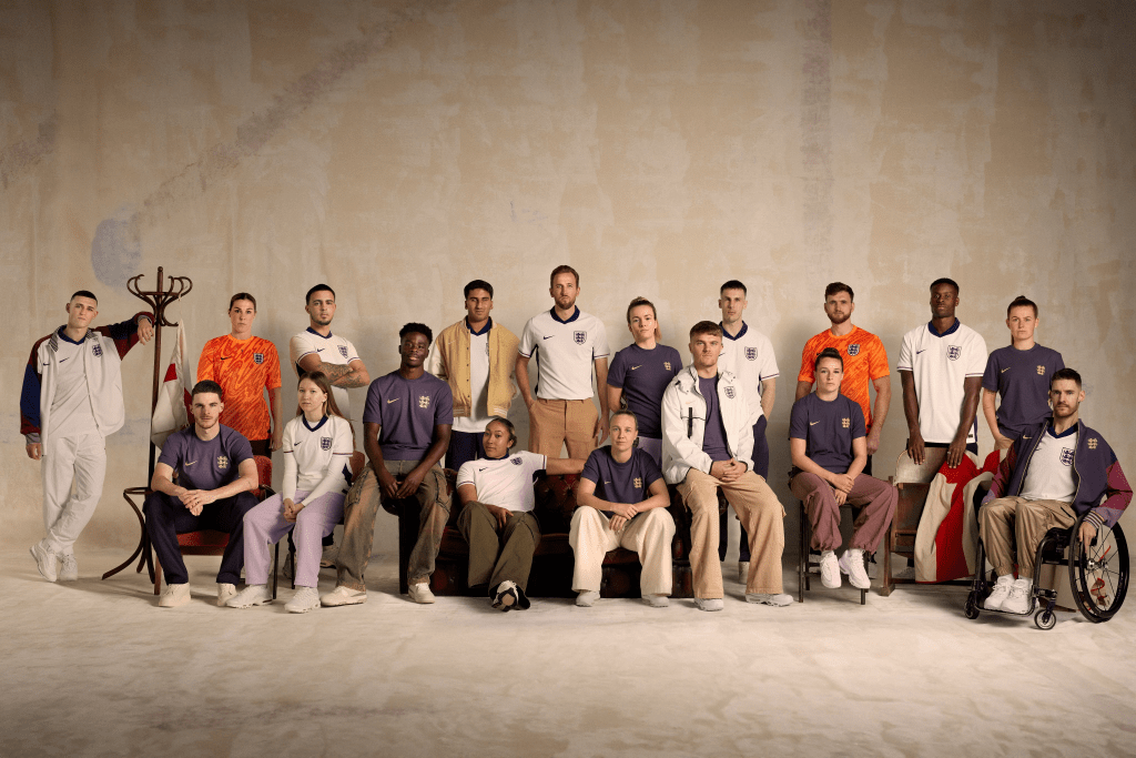
It is that time again for The Heat Press to fire up, as we take a more detailed look at the new England Kits for 2024/25 released by Nike on Monday 18th March 2024.

Nike have been Kit Manufacturer for The Three Lions since 2013 and these kits are sixth set of kits produced by the US Giants in this time with both the Home (Primary) and Away (Secondary) kits released at the same time which is now the standard for International Kit Launches, as well as being in a Major Tournament Year.

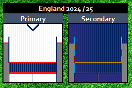
Home (Primary)
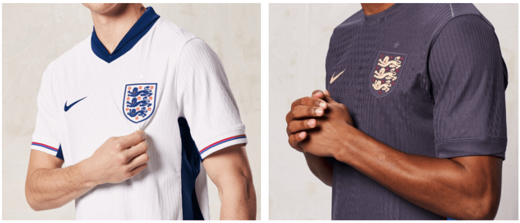
Tradition remains with the Home Kit, white shirt, navy blue shorts and white socks. The shorts and detailing within the appears to be a little darker than its predecessor.
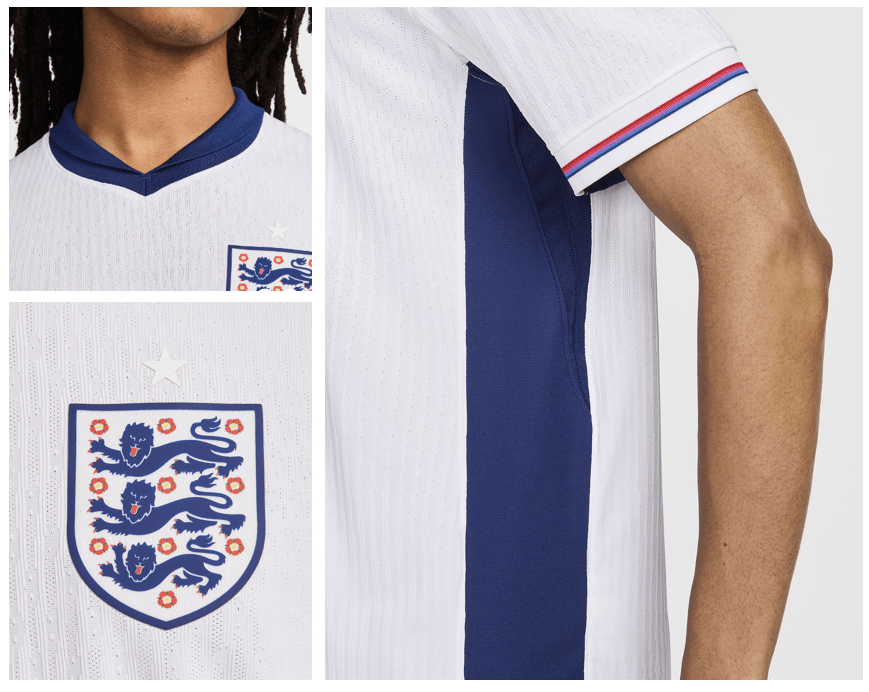
The shirt is one for the traditionalists, with its blue collar which appears to be interesting in design, almost a hybrid between a “flappy” and fixed collar, not sure it will be one of those players and fans that like the “popped” collar look in their shirts.
I do like the detailing on the cuffs, the use of both red and a lighter royal blue works well (along with some purple) and give me some 1982 Admiral vibes, a subtle but nice detail that I am all for in this case.
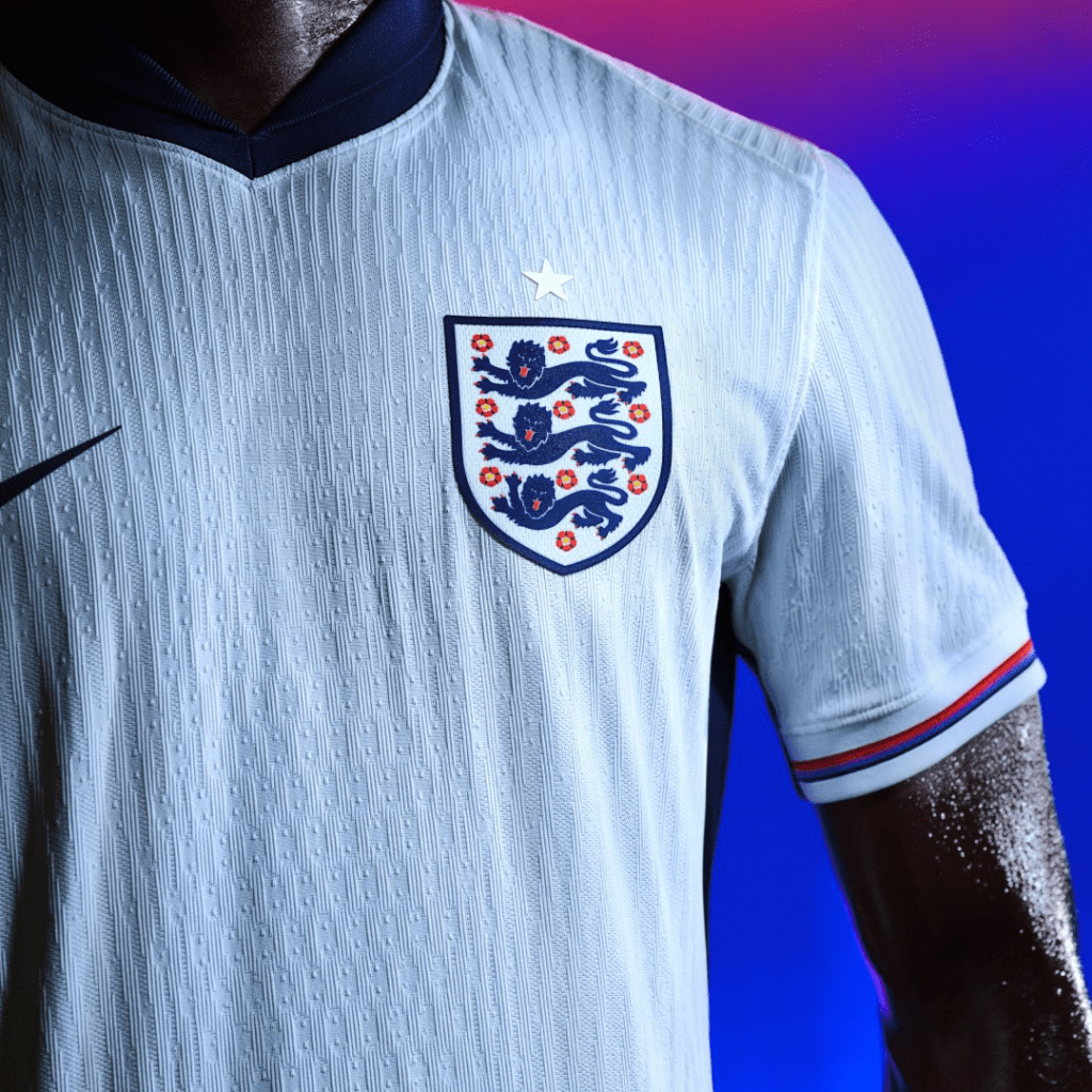
Some nice detail on the back of the collar, with a St George’s Cross design using some of the collar palette of the full kit range here, using the the same colours as the cuff bands from what I can see.

The blue side panel is another element within the design of the shirt, it appears to be an evolution of the “lightening” style side panel from 2021/22 Home Shirt and a design feature often seen within shirts in recent years from several kit designers.
Taking a closer look at the rest of the kit. With the shorts there is a nice trim, which replicates the cuffs on the shirt with red and royal blue, with this being placed at the bottom of the short also provides a different look and something not really seen in England Kits since the Mid 90s. Finally we see the use of red / royal bands in the sock cuffs, so this element runs through out the whole kit, something I am very much in favour of.

Away (Secondary)
This is where we see a change from the norm. In terms of tradition, I am not one of the those that believes England’s Secondary Kit should always be Red, I am more than happy with alternative colours being explored and my favourite Kit of all time is the 1988 England 3rd Kit, which is Sky Blue!
The 2024/25 Kit is one that brings a new colour to the England Kit Palette, offically labelled as “Dark Raisin”, it is a shade of purple, almost dark indigo (1996 Vibes anyone??) and I think it works really well and the overall design of the kit appears to be quite a classic look, with a simple but really nice wrap around collar and with the cuffs match the colour of the shirt to give a different feel from Primary Kit.
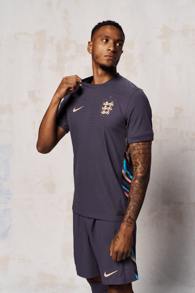
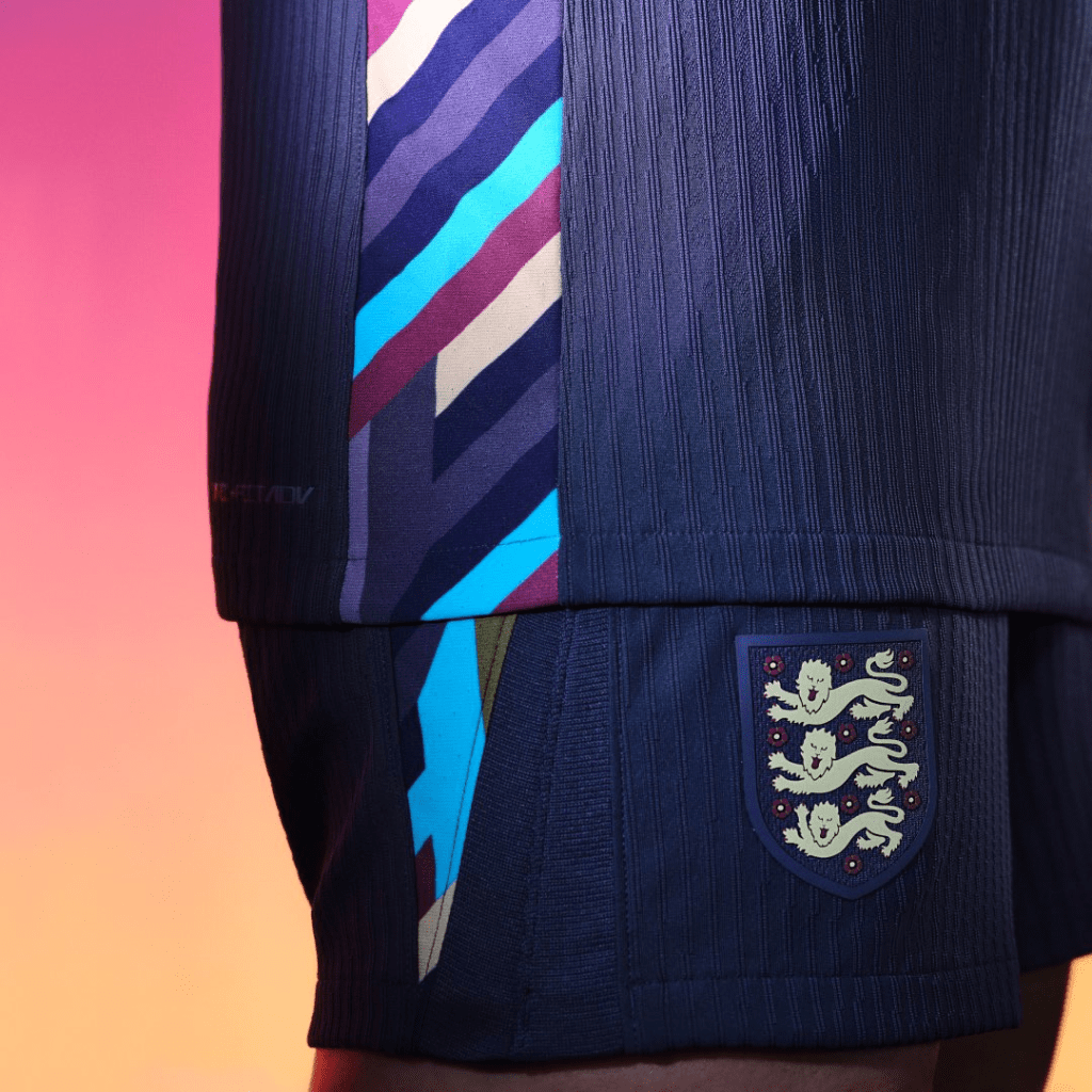
Where the design moves away from the traditional feel, is in the side panel… an interesting array of colours and patterns but given its placement within the shirt does not take away from the overall look of the shirt (and shorts). In the published blurb from Nike regarding the Kit they describe these panels as the following:
“Graphic side panels on the Away kit pay homage to forward-thinking fashionistas“
Now, I am not sure about that but the important thing to me is how it looks, and I think it works well, bravo to those forward thinking fashionistas!
I want spend a moment to appreciate the National Crest in this Kit, this is beautiful and might well be my favourite England Crest seen on Kit ever… it is beautiful, the colour choices work so well, the deep red of the roses, the gold lions just perfect…!

One design element that would like to have seen is with the Star above the National Crest, which signifies England’s soliatry World Cup Win, being in the same colour as Crest / Logo (Navy in Primary and Gold in Secondary) would have been my preference, rather than the same shade as the shirt
This has been the case for a few years now so I do wonder if its a choice by the FA rather than Nike as it has blended into the shirt in all but the first Nike shirts from back in 2013.
In Summary….
The more I look at the kits the more I like what I see, of course final judgement will be given when the kits are seen in action which will be in the fixtures against Brazil (Saturday 23rd March) where it is reported the Secondary Kit will worn and Belgium (Tuesday 26th March) where we will see the Primary Kit.
There are some elements of the kits that I really do like, in the Primary Kit, the Red / Blue bands in cuffs of the shirt, shorts and socks is something I think works well in bringing the whole kit together and in particular the shorts are really nice.
The Secondary Kit is a brave design desicion in terms of colour, which I applaud, the crest is wonderful and really works with the colour of the kit and although I not 100% sure on the reasons behind the side panels, I do really like the design of them and the colours used, so a big thumbs up from on that Kit!
Regular followers will know I track all kinds of kits in my very unique way, here is my illistration of the two kits all set for Euro 2024 Kit Log.
The Kit is exclusive to the England Store from Thursday 21st March 2024 for one week before it goes on general sale at other sites and can be purchased from here
What are your thoughts about the new England Kits, like or dislike?? Let me know at @Kit_Geek or in the comments below

One thought on “The Heat Press: England Kits 2024/25”